Monday, November 24, 2014

Christmas Tag Card

Although I usually don't make my own Christmas cards, it's easy to find inspiration this time of year. I have some new stamps that I won in a drawing (Winter Wonderland by Winnie & Walter) and wanted to try them out:


I started with a plain manila tag, colored with Broken China distress ink and a blending tool. I inked the tree stamp with Peeled Paint Distress Ink and spritzed it lightly with water before stamping over my blue background. After heat setting, I mixed up a little white acrylic paint with water and flicked it over the tag with a paintbrush to create a snowy effect. 

The stag was stamped with Ranger's Potting Soil Archival Ink and coated with clear embossing powder while wet. After heat setting, I poured on additional embossing powder and heat set it again for a nice, smooth look.

I wanted to layer some papers behind the tag, so I chose a red plaid and cut it into a tag shape. The white paper with green dots is a Project Life journal tag which came printed with grid lines. I stamped the dots using Penny Black's Dots in Space stamp and Peeled Paint ink, then cut it into a tag shape. After punching holes in my homemade tags, I tied them behind my stamped tag using some dark red sheer ribbon.

The white panel behind the tags started as plain white cardstock. I used Ranger's Texture Paste through a Prima chevron stencil, then sprinkled some iridescent embossing powder over that. I let it sit for a few minutes and then heat set it.

The sentiment is inked with Potting Soil and embossed with clear powder. I colored the white cardstock with Aged Mahogany Distress Ink and a blending tool, and cut the banner shape by hand.

Everything was adhered to a dark brown cardstock base, cut to be a top folding card.

I'm linking this card up to two challenges: Winnie & Walter Playdate #4 and Muse Challenge #95. I pulled inspiration from both of these challenges to make my card. My colors I chose from the Winnie & Walter image:
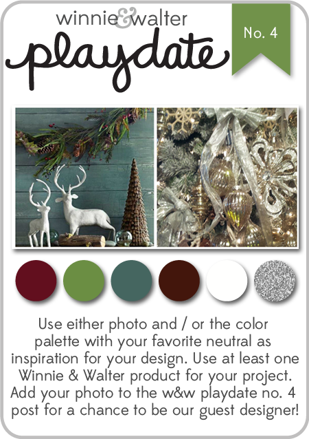
w&w_playdate4_oct2014
Winnie & Walter Playdate #4

The idea of layered tags came from the Muse image:

Muse Challenge #95

I hope you have a great time this week, enjoying Thanksgiving with family and friends!

Immi

Friday, November 14, 2014

Muse #93

I had fun this week taking inspiration from the card posted on the Muse blog.


I took away a couple of things from the original card: the simple shape of the tree and the "jewels" adorning it. 

Using Strathmore Bristol, I inked the paper with green Distress Inks, flicking some water droplets on top after heat setting it. I trimmed out my tree shape and set it aside.

For the background, I wanted to try to imitate a night sky. There are several good tutorials out there, and after watching a couple, I pulled out three shades of blue Distress Inks. These blend really nicely on the smooth surface of the Bristol paper. After heat setting, I decided to try to deepen the colors and was really amazed at how much more intense I was able to make it. I love the way that Distress Inks blend with each other!

I used a couple of different products to imitate the starry sky - the effect I like the most was simply dotting on Iridescent Medium by Liquitex.

I glued down some sequins onto my tree and was happy to find that I had a star shaped sequin for the tree top. The tree trunk was cut from some brown paper in my scrap drawer. Now that I think about it, the only stamping on this card is on the sentiment banner. I don't know the name of the set that the word came from, but the little red stars are from a Hero Arts set called "Birthday Messages". I used Stampin' Up! ink in Real Red for the stars and also to run around the edge of the banner.

Here is the original inspiration card:

Muse #93

I hope you have a great weekend!

Immi

Wednesday, November 12, 2014

Getting in the Holiday Mood

I have a couple of projects to share for this week's Monday challenge from Simon Says Stamp.

First is a card I made, inspired by this card.


I started with a kraft cardstock panel. I stamped the sentiment first to be sure that the snowflakes would fit around it. I combined snowflakes from multiple sets (Stampin' Up! and Inkadinkado) so that each one would be different. I used a silver pigment ink and covered that with silver embossing powder. After heat setting, I wanted to use some kind of thread or ribbon to make the snowflakes look like hanging ornaments. I remembered that I had some thin silver cord, so I tried that. I put down tiny dots of Glossy Accents to hold the ornament strings in place, then tied teeny little bows and glued them above each snowflake. I put a heavy book on top until everything dried. Then I wrapped the cord to the back of the panel and taped it down. The stamped panel was mounted onto a navy card base. I was surprised how quickly this came together. In retrospect, though, I don't know if I'd use the silver with kraft again. I'm not sure there's enough contrast. Live and learn, I guess.

Next is an ornament:


To make this, I cut a scalloped circle from watercolor paper using a die set from Spellbinders. The stamp I used is an old one from Stampin' Up! that I've had for many years. I used Versafine Black Onyx ink and embossed it with clear embossing powder. To color the image, I used Distress Inks diluted with water and some Stampin' Up! markers in a few spots.

I cut three more scallops and glued them all together, using a book to weight it down until dry. I decided to run a Versamark marker around the edges and dip them in silver embossing powder. I really like the way that turned out. Then I used a bookbinding tool to punch a small hole in the top and used some of that thin silver cord to make a hanging loop.

That's it for now. I hope your week is going well!

Immi


Tuesday, November 11, 2014

Take It, Make It Challenge : November

The November Make It Take It challenge from Craft Stamper Magazine just about had me stumped. The challenge is to use non-Christmas themed stamps to create a Christmas or holiday card. I enjoyed seeing the examples from the Design Team, but I was drawing a complete blank. And then...it came to me! Alphabet stamps in the shape of a tree! Now I was getting excited to see if I could make it work.


I knew I would need to use a clear stamp set so that I could see exactly where each stamp was being placed. I pulled out Typewriter Alphabet by Stampendous which I thought would be about the right size. I tried at first to stamp each letter individually, but I quickly saw that it would be very uneven and messy looking. I decided I would use a stamp press, and tried laying the stamps out on a piece of paper but they kept getting bumped out of position. (Insert sounds of frustration.)

I finally figured out that I needed to arrange them directly on the stamp press so that they would stay put until I had them all in position. Ahh! That's much better! I stamped them on my paper and then used some low tack tape to mask off a triangle around the "tree". I heat set it to be sure it was dry and began blending some Distress Ink in Evergreen Bough over the letters. To my dismay, the letters began smudging. Blech!

So, determined to make it happen, I turned the paper over and taped off my triangle area again. I blended the Distress Ink over it and decided to flick a little water over the surface to create some lighter spots. After drying the paper, I inked up the letters again and stamped - much better this time!

Next I took a small stamp that looks like an asterisk and stamped in Stampin' Up! Real Red randomly over the tree. I cut it out and brushed the edges with some more Evergreen Bough and a little Vintage Photo.

Next up, the background. I took another sheet of paper - by  the way, I used Strathmore Bristol for this project - and inked the entire thing with Tumbled Glass Distress Ink. After heat setting, I used the little asterisk along with a couple of others to stamp "snowflakes" with Versamark. I poured some sparkly embossing powder over them and heat set again. It's hard to see in the photo, but the snowflakes have some nice sparkle to them.

I cut a scrap of white to make a hill for the bottom of the card, along with a scrap of brown for a tree trunk. I stitched the hill down and used adhesive for the tree and trunk. I had a little silver star in my stash that I glued above the tree with Glossy Accents so it won't budge.

Finally, I colored some scrap white cardstock with Festive Berries Distress Ink and stamped the sentiment which is from a new set called Winter Wonderland from Walter & Winnie. The sentiment comes as a single line, but since it's a clear stamp I was able to cut it apart and stamp it as a two-line sentiment. That fit my card better. I cut the strip of paper in a banner shape and adhered it down to the background panel. The entire panel was then adhered to a top-folding white card.

I'm happy that I was finally able to come up with something for this month's challenge. Hope you enjoyed  it!

Immi

Thursday, November 6, 2014

Simon Says Stamp Flickr Challenge #5

I had some time this week to see what was going on with the Simon Says Stamp Flickr group. The current challenge is to use embossing - something that's lots of fun. I used two types of embossing on this card - dry embossing with a folder and heat embossing. The main rule with this group is that all projects must incorporate products designed by Simon Says Stamp. I have a few of their sets, so I got busy.


I started with a white cardstock panel that I'd used to practice blending Distress inks. Hopefully you can see that the color moves from dark to light. That was done by blending three colors of Distress inks (Faded Jeans, Broken China, and Tumbled Glass) using the Distress blending tool. It took some time and more than one application, but I finally got a nice smooth transition. I ran that through my Big Shot with the Distressed Frame embossing folder by Sizzix. Then I added some Pumice Stone and Peacock Feather Distress inks around the edges to bring out the raised, embossed area.

Peeking out from behind the heart is a white rub-on from Me & My Big Ideas. It was a bit of a bear to get rubbed on properly, but I finally managed.

The heart is from SSS Music 2 My Ears. I stamped with Versafine Black Onyx and embossed with clear embossing powder. I used some Dried Marigold Distress ink around the edges, and added foam tape to the back.

The flowered paper is from a 6 x 6 pad called Vintage Bliss Paper by Simple Stories. I cut a small strip and stitched it down to the blue panel. 

The gray banner at the bottom was originally a white strip of paper that I colored by pressing Simon Says Stamp Fog ink onto it. I stamped the sentiment, pulling stamps from a couple of SSS sets - Big You and Hello, You. I darkened the edge with Faded Jeans and added three crystal gems.

Finally I was ready to pull everything together. I wrapped some peach silk ribbon a couple of times around my hand to form loops, and taped that down to the blue panel. The heart was placed on top and the gray banner at the bottom. The completed blue panel was adhered to a white card base.

Sometimes when I look at a stamp set I have no idea what to do with it - I just draw a blank. That was the case with the Music 2 My Ears set. I wanted to use it, but nothing was coming to me. I did a Google image search and found a lovely card that got me going. Here it is:

Inspiration Image

If you'd like to see the original post, please click on the photo's caption. It should take you there.

Happy crafting!

Immi


Wednesday, November 5, 2014

Muse Challenge #92

Hello and Happy Wednesday to you! I'm participating in another challenge today from Muse. Here's my interpretation:


I was inspired by several things in the inspiration image (see below): the blue & green dots, the flowers, and the vellum sentiment strip.

For my card, I chose a flower stamp from Hero Arts. I used Hero Arts black ink and stamped several times on textured white paper. The paper is actually the back side of the cover to a pad of el cheapo watercolor paper. I used some of my trusty Stampin' Up! markers to color in parts of the flowers. The blue dots were made with another Hero Arts stamp and Brilliance Sky Blue ink.

I trimmed this panel down and added a thin strip of green cardstock to the right hand side, then set it aside while I worked on the sentiment strip.

I cut a piece of vellum and used Versafine Black to stamp the sentiment from Altenew. I really like the larger sentiments that are available these days and would like to add more of them to my collection. After stamping, I heat set it and then stamped again in Versamark. I poured clear embossing powder over that and heat set again. I was interested to see that the Versamark lightened the black ink so that my sentiment was now stamped in gray. That's not what I had intended, but I went with it anyway.

I wrapped the vellum strip around my flower stamped panel and taped it down to the back. Then I adhered the panel to a dark pink card base.


Here's the inspiration card:

Muse #92

Thanks for reading - I hope you enjoyed this! Till next time,

Immi


Monday, November 3, 2014

Challenge: Anything Goes

Last week, the Wednesday Simon Says Stamp challenge was the wide open theme of "Anything Goes". I had just made a card  that I thought would work for this challenge, but today is the first chance I've had to post it.


This came about as a result of an experiment. I had seen a technique that I thought looked interesting and wanted to give it a try.

I took some off-white cardstock and, using a brayer, layered Distress Ink in Mustard Seed and Barn Door. I then spread on some acrylic medium by Golden called Coarse Garnet Gel. If you look closely, you can see bumpy spots, which are the grit embedded  in this gel. The grit is a dark red color, while the body of the medium is clear. I had no idea how this would turn out, but I thought it was very interesting. The colors of the inks stayed true and were even intensified, and the grit in the gel added texture. I left it to dry overnight - the next morning it was dry but the cardstock was rather flexible. I wasn't sure what to do with it at that point, but I decided to make a card background with it. I trimmed a little off the edges and adhered it to a green card base.

The pear stamp is an oldie from A Stamp in the Hand. It's a very solid image with little detail, so it works well for blending colors. I used several Distress Ink colors in the mini pads and then spritzed it with water. I stamped onto some watercolor paper and added a few splotches of color with watered down ink.

I trimmed it pretty close, tearing the bottom edge of the panel and mounted it onto some dark brown paper. I added some foam adhesive (3M) to the back and set it aside for a moment. I cut a length of twine and looped it around my fingers, then placed it on the card front with the foam mounted pear panel on top. The foam adhesive holds the twine in place.

The "happy birthday" sentiment is from Altenew's Label Love (I'm using that set a lot lately!). I've discovered that these stamps work best for me if I stamp on a surface with a little give, like a pad of paper. I used a teeny bit of foam adhesive on the far right side of the sentiment strip to bring it up to the level of the pear panel. Otherwise it would have been hanging in mid-air and probably would have gotten bent out of shape.

I thought the card still needed a little something, so I found a dark brown button and threaded it with a little gold metallic thread, then glued it on with some Glossy Accents.


This next card has nothing to do with the challenge, but it's so similar I thought I'd include it. The background was made with a checkerboard stamp, inked with Distress Ink and misted with water. It was stamped on some watercolor paper and trimmed a little smaller than the card base.

The pear was done exactly the same as the previous card and also mounted on dark brown paper. I wrapped some twine around the checkerboard panel, and added a die cut "p" just for fun.

That's it for today. I hope your week is off to a good start!

Immi