Saturday, October 4, 2014

More Apron Obsession

I have continued having some fun making aprons, and learning new things in the process. I still have several apron patterns I'd like to try!

This first apron illustrates how things often go for me. I was at the fabric store, looking for bias tape for a half-apron, and came across the cutest fabric AND it was on clearance! The clearance dot was ringed in red, so I checked the chart, and was super excited to see that it was 90% off! Wow! Of course, at that price, I had to go for it! I checked the yardage requirements of one of my patterns, and went to the counter to get the required amount. After the employee had cut it, she told me the price per yard, which was higher than I thought it should be. I'm not great at math, but I knew that what she was quoting me was not 90% off. I questioned her, and she told me that the red ring was to highlight that the dot was white, which made the fabric 50% off. Bummer! I decided to go ahead and get it anyway, but I was disappointed. Typical Immi trick, though! Here's the apron:


I realized when I was ready for the finishing touches that I had never made a buttonhole with this particular sewing machine. I discovered that it is not at all intuitive, and it took lots of trial and error on some scraps before getting it right. I finally succeeded and I'm quite happy with the way it turned out. It has a single button at the top of the back and also ties around the waist in the back. The bottom front is divided into three pockets.

This next apron I made is from some fabric I had purchased quite a while ago - I can't remember what I had intended to do with it, but while I was on a roll, I went with a half apron. I don't even wear half aprons much, but I was having too much fun to quit. If I were to do this one again, I think I'd rather cut the pockets a little larger so that I could hem them rather than using the bias tape as the pattern directed. I really think this fabric is cute, and I enjoyed making such a simple project!


Now go out and do something creative!

Immi

Friday, October 3, 2014

Aprons, True Confessions, and a Thank You

I've been on a bit of a sewing kick lately. One of the flaws in my character is that I tend to flit from one thing to another. I dabble in lots of things and master none of them. Anyway, back to the sewing kick. I've meant for years to make myself some new aprons. I love all the resurgence in interest in vintage apron patterns and fabrics that is so popular now. Aprons are so utilitarian, but women have found ways to make them beautiful, too.

Here's one I made that was as cute as a button, but did not fit me at all.


I should have known! I have avoided boat neck tops for years because they do not flatter me. The large scooped yoke on this ended up being way to big for my narrow shoulders. An off-the-shoulder apron might be sexy, but would be such an annoyance in the middle of a busy working kitchen! Too bad, because I really liked the pattern and the fabric. My consolations are that I learned some things from making it, and I already had the fabric and the pattern at hand. (Here's where the True Confessions part comes in - I've had this fabric for YEARS and I Bought It With No Clear Idea What To Do With It!! Is it a character flaw to buy fabric just because???) *Note: my mom has suggested that I try some darts for a better fit - maybe I can still rescue this.


One of my favorite aprons is one that my mother made for me many years ago. It's a smock-style apron, and I have worn that thing to smithereens! I love it because it's quick and easy to put on - no fooling with ties or bows. Just a few quick snaps and I'm good to go. As you can see, it's really time for it to go to the rag bag - it's not even decent enough for Goodwill!


Old Favorite
All Worn Out!

I looked for a long time for a replacement pattern, but couldn't find what I wanted in the fabric stores. I finally stumbled on it in a newspaper and ordered it. Exactly what I wanted! I used another length of some "just because" fabric to make my new one.

Brand Spanking New!
I'm happy with the way it turned out. I did have to go to the store to buy some bias tape and the snaps. I had never worked with this type of snap fastener before, and messed up the first one. I got the hang of it though, so another lesson learned! I bid the old apron a fond farewell, and the new one is hanging in the pantry ready to go. Thanks, Mom, for a great gift! You probably had no idea how much use I would get from it, nor how much comfort I had as it became an old friend!

Till next time,

Immi

Wednesday, September 17, 2014

Simon Says Stamp Flickr Group Challenge

I recently learned about a Flickr group designed to showcase what others are doing with Simon Says Stamp products. I have a few of their stamp sets, so I thought it would be fun to participate. The group has just started posting regular challenges as prompts for members to use.

The first prompt is a color scheme. The instructions state that at least three of the five colors should be used. When I first looked at it, I really had no idea what to do with those colors. These are not colors I would typically work with, but that's part of the challenge.


Color Challenge Inspiration by Simon.Says.Stamp

I pulled out my SSS stamps hoping inspiration would strike. Nothing. So, I followed the advice of a well-known and very savvy stamper, Jennifer McGuire. I did a Google search on the name of one of my sets and looked at images of what others had done with this particular set. I was struck by this card:

Simon Says Stamp Wednesday Challenge: Anything Goes, Memory Box | shurkus.com

I liked the white text on a gray panel against the bright yellow on the background. Using someone else's work as inspiration (in the cardmaking world) is known as CASE. Sometimes this is known as Copy And Steal Everything, but some prefer Copy And Share Everything (I'd rather think of it that way, too!). As Solomon said, there is nothing new under the sun!

Here's my card:


I started my card with a piece of watercolor paper. For the green in the color sample, I chose to use an old jar of Lumiere paint. This paint is old and has become quite thick, but it worked beautifully to spread through some stencil waste to create the green dots in the background. I did this in a random way to create interest, color and texture. After that dried, I painted over the panel with various shades of yellow watercolor and let that dry. 

Just as my inspirational stamper did, I white embossed the sentiment on white cardstock. I colored over it with Pumice Stone distress ink, using a blending tool. I dripped some water over that and let the water react with the ink. Distress ink is great for this technique! I mounted this panel onto some black cardstock and sewed around the edges with black thread. 

After trimming the edges of my watercolor paper, I used plenty of adhesive to tape it to a black cardstock base. The sentiment panel went on top of that using 3m foam tape for a little extra dimension. As a final touch, I glued down a bright orange butterfly punched from some thick textured cardstock - the same cardstock I mentioned here.

I love the finished result. This is such a sweet saying, and it means even more to me because my daughter sings this to her children. They love it, and I love hearing her sing it to them. I have enjoyed singing it myself on the occasions when I've had the opportunity to put them to bed. Makes me want to dash down there for a visit!!

Till next time,

Immi


Monday, September 15, 2014

Challenge: Rock the Techniques

Today's challenge on Simon Says Stamp is to feature a project using the technique of your choice. I've decided to post a card I made using watercolors and liquid frisket. If you aren't familiar with it, frisket is used to mask off areas in order to retain the white paper before doing any watercolor painting. I got this idea from an online class called Watercolor for Cardmakers. I haven't done too many of the lessons yet, but I'm enjoying what I'm learning and having fun playing with paper and watercolor.

Here's my card:

I stamped the "thanks" greeting (Stampin' Up!) with black ink and made sure it was completely dry. I painted over it with frisket. After the frisket was dry, I then blobbed on (highly technical term) some watercolors. I added a few splatters and let everything dry. When I peeled off the frisket, the stamped image was still nice and clean underneath. Simple and fun. I mounted the watercolor paper on a pink card base and that was that!

Happy crafting!
Immi

Friday, September 5, 2014

More Alcohol Ink Cards

As promised, here are some additional cards I did that utilized alcohol inks. These all use the same cool filmstrip stamp by PaperArtsy. They all have a similar feel with lots of fun layers of miscellaneous papers. All three also feature the same "missing you" stamp from Tim Holtz.


The first card doesn't have much stamping - only the sentiment and the filmstrip image. The rest of the color and interest comes from layers of paper.


The next card also has some stamping along the purple cardstock (a border stamp - unknown) and along the gold cardstock to the left (Technique Tuesday). The panel of text is from an old book.


Finally, the last card also has limited stamping - again, the filmstrip and the sentiment. The alcohol ink background makes a stronger statement here. 

That's it for now. I enjoyed making these and sharing them with you.

Happy crafting!

Immi


Tuesday, September 2, 2014

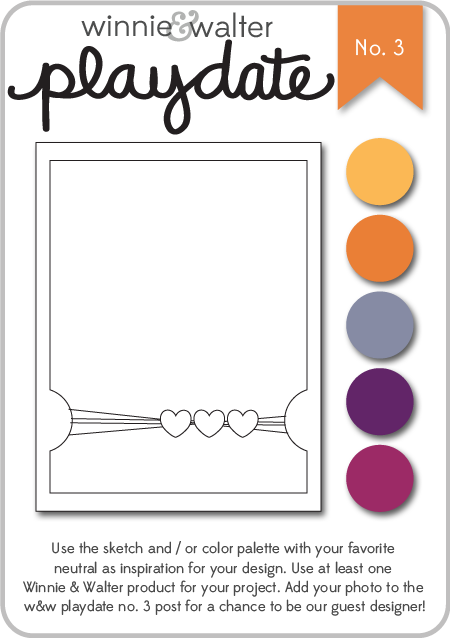
Winnie & Walter Playdate #3

I stumbled across this challenge this evening and decided to do my best to get a card ready to participate. Winnie & Walter is a fairly new stamp company. I've been seeing their stamps used on a variety of blogs I follow. I don't own any of their stamps yet, but they also offer digital files. I downloaded a file to cut on my Silhouette, and used the sketch provided to create my card.

w&w_playdate3_august2014

I chose to use the sketch along with some of the suggested colors. Here's my card:


I started with a kraft cardstock base. On top of that is a layer of an orange sunburst paper that I edged with Worn Lipstick Distress Ink. The purple layer is a scrap of cardstock I had that I coated with clear embossing paste, using a stencil from Jenni Bowlin. After that dried, I punched out the half circles, and used the Worn Lipstick again around the edges. The "hello" is the digital file I downloaded from Winnie & Walter. I opened the file on my Silhouette and discovered that I didn't know how to cut a png. I had to get on the web to do a little research, but found it was quite easy after all (sigh of relief). I cut it from a pink patterned paper from a Colorbok paper pack - Light Bright. That's also where I got the orange starburst paper. I wrapped some thin gold cord from my stash around the card, creating some loose loops. I glued the loops down with Glossy Accents, also using that to attach the flower and button. For the "hello", I used teeny tiny drops of Glossy Accents to be sure it would stick to the embossed paper beneath. Finally, I used some Scotch 3M Mounting tape to attach the purple panel to the cardfront. This gives it a little extra height which is kind of cool.

I don't know why I create these situations for myself, but I was bound and determined to submit this - the deadline is later tonight. I'm happy with my result and I guess that's what counts the most!

Till next time,

Immi


Alcohol Ink Cards

Whew! I can't believe that it's already September. Looking back, I see that it was July since I last posted, but in my defense I've had a lot of great family stuff going on.

I thought I'd share some cards I did using alcohol inks. I don't get these out very often - they can be messy, and I am limited in the techniques I've learned for them. I do love the cool backgrounds that can be created with them, so here goes.


This first card has a bright and bold background created with alcohol inks on glossy cardstock (all the cards I'll show use glossy cardstock). The cute little partygoers is a stamp from Prima. The "happy birthday" is from a Tim Holtz set. I did a little simple watercoloring with dye inks on the kiddos' clothing, and mounted the panel on some bright orange cardstock. One of these days, I'm going to run out of that cardstock and I will be so sad. It's actually leftover covers from a planner made one year at the high school where I worked. Rather than toss them in the recycle bin, I brought them home - the color is great and the paper has a cool texture to it.


This next card is more subdued, and I used some metallic mixative along with the inks which gives it a pearlized sheen - very pretty! I stamped a large leaf (Rubber Nature ArtStamps) along with the "hello" sentiment (Jillibean Soup) and mounted both on some gray cardstock I ran through my Sizzix with an embossing folder to give it that raised text.


This card with the sweet bird shows another bright alcohol ink background, but just a little strip of it. I like the way it adds some great color to a black & white stamped image. The card front is stamped with a French script stamp (Hero Arts), a flourish (unknown), and a great scattered dot stamp I've had for years (Stampin' Up!).

One more...

This one might have been better with a less busy background, but I do like the combination of colors. The gorgeous flower arrangement is a stamp by Prickley Pear. I should try coloring it with watercolor someday.

I've got a few more cards that I'll post later - they all feature the same stamp.

Till then,

Immi