Showing posts with label Archival Ink. Show all posts

Monday, July 27, 2015

Challenge: No Ordinary Paper

The Monday challenge this week on Simon Says Stamp is to use some type of paper other than regular cardstock. There are several wonderful examples of work to provide some inspiration.

I've been experimenting lately with Bristol. I bought a pad on sale and have tried some stamping techniques on it. It is very smooth, has a nice weight, and takes ink quite well (much better than some of the cheaper cardstock I've tried). Here is one of the cards I did:


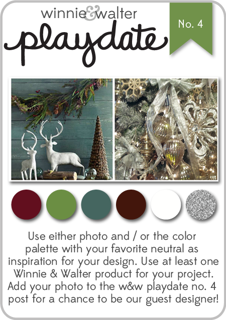
I started with a piece of Bristol, cut to 4.25" x 5.5". I blended Antique Linen Distress ink over the surface with a blending tool. Next, I stamped the tree (Xmas Constellation by Penny Black) with Doll Pink ink from Simon Says Stamp. The sentiment is from Winter Wonderland from Winnie & Walter; it is stamped with Potting Soil Archival ink and heat embossed with clear embossing powder.

The splotches on the card front are made by mixing Broken China Distress ink, water, and a little Perfect Pearls pigment powder. This mixture is picked up with a small brush and flicked over the card front. I also did a little mixture of water and Perfect Pearls with no additional color and flicked that over the surface as well. Hopefully it gives the suggestion of snow, but maybe it just looks messy!!

I trimmed the Bristol panel down slightly and mounted it to a dark brown card base. The two thin colored strips on the right were made by rubbing ink directly from the ink pad onto the surface of some scrap Bristol - I used Broken China & Doll Pink. Once the ink had dried, I cut the strips and glued them down. Since the blue strip was slightly raised due to being layered over the Bristol, I cut two tiny pieces of cardstock to glue underneath the ends to keep everything even.

I hope your week is off to a good start!

Immi


Friday, July 17, 2015

Moleskine Notebook

This month's Make It Take It challenge on the Craft Stamper blog is wide open for interpretation since "Anything Goes"! The only rule is that it must involve stamping. I've decided to submit a little Moleskine notebook I did and keep my fingers crossed that it's a winner.


This was a fun little project. I had previously stamped on the cover of this notebook but wasn't too happy with the result. I decided to try stamping something new on watercolor paper and figure out some way to attach the panel to the cover.

I chose to use some clear stamps from Martha Stewart which I stamped in black Archival ink. I chose this ink since it is permanent and I knew I'd be adding watercolor later. Before doing any watercolor, though, I decided to try sprinkling some masking fluid randomly over the surface so that some spots would stay a nice crisp white.

After the masking fluid dried, I had fun with several colors of Distress ink, rubbed on my craft sheet and diluted with water. I colored the butterflies first. After they were dry, I created the background, allowing colors to bleed together on the wet paper.

When everything was dry, I rubbed the dots of masking fluid off, revealing the white dots. I really like the way it looks. 

Now I had to figure out how to attach it to the cover of the notebook. My experience has taught me that it would be really tough to glue it down so that there was no danger of the edges ever lifting. I decided to try machine stitching to see if I could get through the thick watercolor paper as well as the stiff cover of the notebook. It worked wonderfully, and I really like the way the black stitching looks around the edges. (I used a corner rounder on the two right corners since those corners were also rounded on the notebook.)

Even if this doesn't win this month's contest, I'm still quite happy with the way it turned out!

Till next time,

Immi

Tuesday, April 7, 2015

All Layered Up


Hello! I'm popping in today with a quick post, linking to a new challenge. Virginia's View has a challenge to use layers or dimension, and this card I made a while ago seemed to fit the bill.

I started with a panel of watercolor paper and a striped background stamp from Stampin' Up! I inked it with Distress Ink, then spritzed the stamp with water before pressing the paper over the stamp. The flower stamp is called Hollyhocks from Prickley Pear. It's stamped with black Archival ink on watercolor paper, and colored with watered down Distress Inks, then torn roughly around the image. I mounted it onto the striped panel, then went to work on the sentiment.

The word "celebrate" is from Altenew's Label Love, stamped in black and trimmed with a small white border. That is mounted onto the striped panel with some foam tape to help it stand out a little bit. Before sticking it down, I made some messy loops with thin gold thread, and used the foam tape to hold it in place. Everything is then mounted onto a navy cardstock base.

I hope your week is going well!

Immi

Saturday, March 21, 2015

Muse Challenge #109

I had some time this morning to play around, so I thought I'd try my hand at the latest Muse Challenge. Here's my take:

Muse Challenge #109

Here's the original challenge image:


I loved the yellow background contrasting with the bright blue, the placement of the stamped image, and the Polaroid-style frame. Such a cheerful card!

I started with a piece of smooth white cardstock and blended Distress Inks in Squeezed Lemonade and Mustard Seed over the surface. Then I misted a little water over that and blotted it off. I also like the darker specks of color in the inspiration card, so I put a little Lemon Zest Dylusions spray on my craft sheet and diluted it with water. Then I picked up the color with a small paintbrush and flicked it over my paper. Since I ended up trimming the paper down quite a bit, all that detail doesn't show up in the finished card, but I enjoyed doing it anyway.

I chose an old stamp from a Stampin' Up! set called Nice & Easy Notes and stamped it in black Archival ink on a scrap of watercolor paper. I used Distress Markers in Spun Sugar, Picked Raspberry, Spiced Marmalade, Mowed Lawn, Broken China, and Stormy Ocean to add color to my stamped image. Then, with a wet brush, I blended the colors and dried everything with a heat tool. I added some splashes of yellow over the top, using the same method described above. I used a square punch and a paper trimmer to create my pink "Polaroid" frame, and glued the watercolored image behind it. Then I mounted that onto my yellow paper and trimmed it down. I pulled out a fun printed paper I had in my scrap bin - I wish you could touch it, as the pink flowers are flocked. That was trimmed a little smaller than the turquoise card base and everything was mounted with a tape adhesive.

I had a  scrap of blue glitter cardstock that I punched with my favorite Martha Stewart butterfly punch. That has to be one of  the best purchases I've made - I've used that same punch so many times, and I never get tired of it! I decided that I wanted the blue flowerpot to match the butterfly and turquoise cardstock a little better, so I used a Stampin' Up! marker in Tempting Turquoise to add some additional color, blending with a wet brush. At first I was wasn't sure about the green color that it created when blended with the Distress Inks I'd used earlier, but I really like the finished result. I think it has more depth and interest than before - glad that one turned out okay!!!

For one final touch, I added some Glossy Accents to the flowers - here's a closeup:

Glossy Accents Closeup
Have a great weekend!

Immi


Friday, March 20, 2015

Welcome Spring!

In honor of the first day of spring, I made a small mixed media canvas today.

Rejoice!


I started off with a small, 4 x 4 blank canvas. The first step is always the hardest, so I find it's best to dive in and get something - anything - onto that blank surface. I thought I'd try some stamping and embossing to create a resist. I used Hero Arts Paint a Flower, and stamped with Versamark, embossing with white powder. It's difficult to stamp well on a canvas because of the give in the middle, so I had to fill in with a Versamark marker.

Then I started messing around with some Distress paints, spreading them on the canvas and misting with water to move them around. I first used Spun Sugar and Wild Honey. I liked it, but the Spun Sugar is so pale that the white embossing really didn't show up as well as I wanted. I decided the background needed to be darker, so I brought in Picked Raspberry Distress paint and added more Wild Honey.

To make a long story short, I ended up with a hot mess. When that happens, I think the thing to do is start layering things on top and start anew. I glued down a couple of strips of printed tissue tape using a matte gel medium. I went over the surface again with the Distress Paints and water. To add some additional color, I sprayed the canvas with Heidi Swapp's Primrose Color Shine.

By this point, I liked the background, but the mess of my embossing was still there. I thought I would try stamping the flower on tissue paper and gluing it over the embossing. I ended up stamping it three times, cutting closely around each flower, and using the matte medium again. I allowed the stems of the flowers to continue over the bottom edge of the canvas, and the left-most flower goes over the left edge.

I pulled out an old Stampin' Up! scripture stamp, using tissue paper again and waterproof ink (Ranger Archival Black). I cut around the words, and glued that to the top right of the canvas. I played around with trying to add some green twine towards the bottom, but couldn't figure out a way to repeat that color anywhere else. So, I gave that idea up. After digging around, I pulled out some clear, colored "gems" and glued them on, trying to keep things balanced. As a final touch, I also added some teeny tiny pink and purple sprinkles and a little clear glitter. Since this is the last day for the Hero Arts Nature Challenge, I promise this is the last post connected to it!

Have a great weekend!

Immi

Monday, March 2, 2015

Distress Watercolor Card

I had some fun trying out a new stamp set from Unity . I particularly like the designs of Phyllis Harris - they are sweet and whimsical. They are also great for coloring techniques. I am such a beginner at coloring of any type; some artists are quite skilled!


I stamped my image on some watercolor paper, using Archival Gray ink which does not bleed when wet. It also provides more softness than stark black. Using several shades of Distress Inks, I would rub the ink pad onto my Ranger craft sheet, then apply to the paper with a wet brush.When I had all the coloring done, I mounted the panel onto a blue patterned cardstock, leaving a wider margin on the right hand side. I tied some thin brown twine twice around both papers and tied it in a simple knot.

Before mounting this panel onto the striped paper, I added several strips of 3M foam tape to the back to help even things out since the twine added some bulk. Then I stamped my sentiment directly onto the striped paper with Hero Arts Black ink. Everything was mounted onto a kraft cardstock base.

Below is the inspirational image from the Unity website; I chose to try to follow this color scheme and will like this up to the current Unity challenge.


Inspiration Image

Till next time,

Immi

Monday, February 16, 2015

Thanks!

Today I'm enjoying a day off from work. I recently started a new job, and I'm missing my craft time! I decided to make a "thank you" card today for a co-worker of mine. She made a little sign with my name for my work space as a welcoming gesture - so nice of her! I thought it would be fun to use the Simon Says Stamp Monday challenge, A Piece of Paradise, to jump start my project.


I started with a piece of watercolor paper, cut to A2 size. I sprayed it with water, then had fun with several spray inks (Glimmer Mist & October Afternoon), letting the colors run and blend together. After drying it with my heat gun, I took a Tim Holtz stencil (Burlap), and spread Ranger's Texture Paste randomly through the stencil. I let that air dry for a little bit, then finished the drying with the heat tool. I used some Mini Distress inks and blending tools to add some color to the top of the texture paste. Next I die cut watercolor paper into flowers & leaves using Tattered Florals and Tattered Leaves dies from Sizzix. I sprayed those with inks as well, but they seemed a little blah. I added some interest to them by using various stencils & stamps. For the leaves, I used the Typewriter Background stamp from My Favorite Things and Mowed Lawn Distress Ink. For the purple flower layer, I used Tim Holtz' stencil, Dot Fade and Seedless Preserves Distress Ink. For the yellow flower layer, I stamped with Dandelion Archival Ink and a Penny Black stamp called Penmanship. The blue flower layer is stamped with Peacock Feathers Distress Ink and a mini script stamp from Prima. I also edged the leaves with a Black Soot Distress Marker to help them stand out more from the background. I glued the leaves & flower down with Perfect Paper adhesive. The sentiment is from Stampin' Up! (Many Thanks). That was stamped on a scrap of watercolor paper with Versafine Black Onyx, covered with clear embossing powder, and heated. I trimmed closely around it and sprayed it with Sea Glass Glimmer Mist. Then I mounted it on a scrap of purple cardstock, notched on the one edge. I tucked the opposite edge under the leaves when I glued it down. The finished panel was mounted on purple cardstock, using Tombow's Extreme Adhesive. For one last touch, I glued a clear gemstone from my stash as a center for the flower.

That's it for today - happy Monday to you all!

Immi


Monday, November 24, 2014

Christmas Tag Card

Although I usually don't make my own Christmas cards, it's easy to find inspiration this time of year. I have some new stamps that I won in a drawing (Winter Wonderland by Winnie & Walter) and wanted to try them out:


I started with a plain manila tag, colored with Broken China distress ink and a blending tool. I inked the tree stamp with Peeled Paint Distress Ink and spritzed it lightly with water before stamping over my blue background. After heat setting, I mixed up a little white acrylic paint with water and flicked it over the tag with a paintbrush to create a snowy effect. 

The stag was stamped with Ranger's Potting Soil Archival Ink and coated with clear embossing powder while wet. After heat setting, I poured on additional embossing powder and heat set it again for a nice, smooth look.

I wanted to layer some papers behind the tag, so I chose a red plaid and cut it into a tag shape. The white paper with green dots is a Project Life journal tag which came printed with grid lines. I stamped the dots using Penny Black's Dots in Space stamp and Peeled Paint ink, then cut it into a tag shape. After punching holes in my homemade tags, I tied them behind my stamped tag using some dark red sheer ribbon.

The white panel behind the tags started as plain white cardstock. I used Ranger's Texture Paste through a Prima chevron stencil, then sprinkled some iridescent embossing powder over that. I let it sit for a few minutes and then heat set it.

The sentiment is inked with Potting Soil and embossed with clear powder. I colored the white cardstock with Aged Mahogany Distress Ink and a blending tool, and cut the banner shape by hand.

Everything was adhered to a dark brown cardstock base, cut to be a top folding card.

I'm linking this card up to two challenges: Winnie & Walter Playdate #4 and Muse Challenge #95. I pulled inspiration from both of these challenges to make my card. My colors I chose from the Winnie & Walter image:

w&w_playdate4_oct2014
Winnie & Walter Playdate #4

The idea of layered tags came from the Muse image:

Muse Challenge #95

I hope you have a great time this week, enjoying Thanksgiving with family and friends!

Immi