Showing posts with label Watercolor. Show all posts

Monday, July 20, 2015

Published!

I am excited to share this card. I recently had the honor of having this one published in the August issue of Craft Stamper magazine. This is a UK publication, and I enjoy trying their challenges.

Here's my card:


This was done with stamping and watercolor. The main image and sentiment are from Your Wings Exist by Unity Stamps; the butterfly is from Inkadinakdo's Inchies; the flowers are from Hero Arts' Trees, Birds, & Messages.

Thanks for stopping by today to take a look. I got an email yesterday letting me know that another card I've submitted will be published in a few months. Once it comes out, I'll be able to share it with you.

Till next time,

Immi

Friday, July 17, 2015

Moleskine Notebook

This month's Make It Take It challenge on the Craft Stamper blog is wide open for interpretation since "Anything Goes"! The only rule is that it must involve stamping. I've decided to submit a little Moleskine notebook I did and keep my fingers crossed that it's a winner.


This was a fun little project. I had previously stamped on the cover of this notebook but wasn't too happy with the result. I decided to try stamping something new on watercolor paper and figure out some way to attach the panel to the cover.

I chose to use some clear stamps from Martha Stewart which I stamped in black Archival ink. I chose this ink since it is permanent and I knew I'd be adding watercolor later. Before doing any watercolor, though, I decided to try sprinkling some masking fluid randomly over the surface so that some spots would stay a nice crisp white.

After the masking fluid dried, I had fun with several colors of Distress ink, rubbed on my craft sheet and diluted with water. I colored the butterflies first. After they were dry, I created the background, allowing colors to bleed together on the wet paper.

When everything was dry, I rubbed the dots of masking fluid off, revealing the white dots. I really like the way it looks. 

Now I had to figure out how to attach it to the cover of the notebook. My experience has taught me that it would be really tough to glue it down so that there was no danger of the edges ever lifting. I decided to try machine stitching to see if I could get through the thick watercolor paper as well as the stiff cover of the notebook. It worked wonderfully, and I really like the way the black stitching looks around the edges. (I used a corner rounder on the two right corners since those corners were also rounded on the notebook.)

Even if this doesn't win this month's contest, I'm still quite happy with the way it turned out!

Till next time,

Immi

Friday, July 10, 2015

Quick Cards

Hi, all. I've got a couple of quick cards today, both using Unity stamps. Unity is a cool company in Minnesota that produces high quality red rubber stamps. The stamps come unmounted, but attach easily to an acrylic stamp block. The prices are fantastic, and they have designs for all styles.


I stamped the image on watercolor paper and used a combination of Stampin' Up! markers with a wet brush to do the coloring. I also splattered some ink just for fun and added a strip of washi tape across the bottom. 

Next I chose some 6x6 patterned papers from American Crafts and Colorbok to layer behind the watercolored panel. After taping everything down, I added a few Studio Calico sequins for some additional color.


This card also features layers of paper along with simple marker + wet brush watercolor. Although you can't see it in the photo, I also went over the flowers with a clear Wink of Stella marker, which creates a subtle sparkle. The centers of the flowers also got a touch of Glossy Accents.

The stamped panel was stitched to a paper I had in my stash which makes me think of a garden trellis - kind of nice as a background for flowers. I also added the black strip at the side - I never get tired of seeing how black makes other colors pop! The orange paper in the back was chosen to coordinate with the color of the flowers. (I don't remember who makes either of those patterned papers.)

Quick & easy!

Till next time,
Immi


Wednesday, June 10, 2015

Birthday Card

Three of my grandchildren have birthdays in June - keeps us busy attending parties, but we love to participate! I thought I'd share a card today that I've made for one of those birthdays - my soon-to-be 3 year old granddaughter.


This card features a stamp set from Unity Stamps, located in Minnesota. These little chickies are so cute! I stamped the chicks and the sentiment block on watercolor paper with Archival black ink. I used a small watercolor set from Koi to do some simple coloring. 

Since these are small images, I decided to make a tag from the watercolor paper. I used my grandmother's pinking shears to cut the bottom, then layered it onto a slightly larger scrap of purple cardstock. (I always save my scraps until they're teeny-weeny!) I cut the hole reinforcer from a scrap of blue glitter paper from DCWV, using a die from the Framelits Tag Collection by Sizzix. The yellow ribbon is from my stash.

I used some patterned papers for layering from a couple of 6x6 paper pads. The pink/orange is from Happy Day by My Mind's Eye, and the green is from Light Bright by Colorbok. I had half a doily sitting on my work surface, left over from another project, so I thought it would be fun to include that as well.

For the card base, I used a piece of Stampin' Up! Tempting Turquoise. The holes were cut using a border punch called Swiss Cheese by EK Success. 

Although it doesn't show up well in a photo, I also used clear Wink of Stella to add some sparkle to the chickie's hats and some of the stamped embellishments in the sentiment block. On top of that, I put a coat of Glossy Accents. In the light, it shows up well, very sparkly and shiny.

The starting point for this card is the current challenge on the Unity Stamp blog. I thought the colors in the inspiration photo were so cheerful!


Till next time,

Immi


Tuesday, April 7, 2015

All Layered Up


Hello! I'm popping in today with a quick post, linking to a new challenge. Virginia's View has a challenge to use layers or dimension, and this card I made a while ago seemed to fit the bill.

I started with a panel of watercolor paper and a striped background stamp from Stampin' Up! I inked it with Distress Ink, then spritzed the stamp with water before pressing the paper over the stamp. The flower stamp is called Hollyhocks from Prickley Pear. It's stamped with black Archival ink on watercolor paper, and colored with watered down Distress Inks, then torn roughly around the image. I mounted it onto the striped panel, then went to work on the sentiment.

The word "celebrate" is from Altenew's Label Love, stamped in black and trimmed with a small white border. That is mounted onto the striped panel with some foam tape to help it stand out a little bit. Before sticking it down, I made some messy loops with thin gold thread, and used the foam tape to hold it in place. Everything is then mounted onto a navy cardstock base.

I hope your week is going well!

Immi

Saturday, March 21, 2015

Muse Challenge #109

I had some time this morning to play around, so I thought I'd try my hand at the latest Muse Challenge. Here's my take:

Muse Challenge #109

Here's the original challenge image:


I loved the yellow background contrasting with the bright blue, the placement of the stamped image, and the Polaroid-style frame. Such a cheerful card!

I started with a piece of smooth white cardstock and blended Distress Inks in Squeezed Lemonade and Mustard Seed over the surface. Then I misted a little water over that and blotted it off. I also like the darker specks of color in the inspiration card, so I put a little Lemon Zest Dylusions spray on my craft sheet and diluted it with water. Then I picked up the color with a small paintbrush and flicked it over my paper. Since I ended up trimming the paper down quite a bit, all that detail doesn't show up in the finished card, but I enjoyed doing it anyway.

I chose an old stamp from a Stampin' Up! set called Nice & Easy Notes and stamped it in black Archival ink on a scrap of watercolor paper. I used Distress Markers in Spun Sugar, Picked Raspberry, Spiced Marmalade, Mowed Lawn, Broken China, and Stormy Ocean to add color to my stamped image. Then, with a wet brush, I blended the colors and dried everything with a heat tool. I added some splashes of yellow over the top, using the same method described above. I used a square punch and a paper trimmer to create my pink "Polaroid" frame, and glued the watercolored image behind it. Then I mounted that onto my yellow paper and trimmed it down. I pulled out a fun printed paper I had in my scrap bin - I wish you could touch it, as the pink flowers are flocked. That was trimmed a little smaller than the turquoise card base and everything was mounted with a tape adhesive.

I had a  scrap of blue glitter cardstock that I punched with my favorite Martha Stewart butterfly punch. That has to be one of  the best purchases I've made - I've used that same punch so many times, and I never get tired of it! I decided that I wanted the blue flowerpot to match the butterfly and turquoise cardstock a little better, so I used a Stampin' Up! marker in Tempting Turquoise to add some additional color, blending with a wet brush. At first I was wasn't sure about the green color that it created when blended with the Distress Inks I'd used earlier, but I really like the finished result. I think it has more depth and interest than before - glad that one turned out okay!!!

For one final touch, I added some Glossy Accents to the flowers - here's a closeup:

Glossy Accents Closeup
Have a great weekend!

Immi


Wednesday, November 12, 2014

Getting in the Holiday Mood

I have a couple of projects to share for this week's Monday challenge from Simon Says Stamp.

First is a card I made, inspired by this card.


I started with a kraft cardstock panel. I stamped the sentiment first to be sure that the snowflakes would fit around it. I combined snowflakes from multiple sets (Stampin' Up! and Inkadinkado) so that each one would be different. I used a silver pigment ink and covered that with silver embossing powder. After heat setting, I wanted to use some kind of thread or ribbon to make the snowflakes look like hanging ornaments. I remembered that I had some thin silver cord, so I tried that. I put down tiny dots of Glossy Accents to hold the ornament strings in place, then tied teeny little bows and glued them above each snowflake. I put a heavy book on top until everything dried. Then I wrapped the cord to the back of the panel and taped it down. The stamped panel was mounted onto a navy card base. I was surprised how quickly this came together. In retrospect, though, I don't know if I'd use the silver with kraft again. I'm not sure there's enough contrast. Live and learn, I guess.

Next is an ornament:


To make this, I cut a scalloped circle from watercolor paper using a die set from Spellbinders. The stamp I used is an old one from Stampin' Up! that I've had for many years. I used Versafine Black Onyx ink and embossed it with clear embossing powder. To color the image, I used Distress Inks diluted with water and some Stampin' Up! markers in a few spots.

I cut three more scallops and glued them all together, using a book to weight it down until dry. I decided to run a Versamark marker around the edges and dip them in silver embossing powder. I really like the way that turned out. Then I used a bookbinding tool to punch a small hole in the top and used some of that thin silver cord to make a hanging loop.

That's it for now. I hope your week is going well!

Immi


Thursday, October 23, 2014

Make it Take it Challenge: October

So, I'm a little late joining this party, but I'm going to get this squeezed in by the deadline. This is a challenge from Craft Stamper Magazine. I'm not very familiar with it, but discovered it because it was mentioned on a blog I was reading. Every month they issue a new challenge - this month, participants are to use the technique of multi-color stamping. This involves using mulitple colors of ink, paint, etc. on an image.

Here's my card:


I pulled out a leaf stamp by Rubber Nature ArtStamps and started adding various colors of orange and brown Distress inks. After giving it a light misting of water, I stamped that on a cardstock panel. Then I stamped it again on another, lightweight piece of paper and cut it out to make a mask. I put the mask over my leaf, and inked up an old favorite script stamp from Stampin' Up! in various shades of green Distress inks. I stamped the script on top of the masked leaf, and then removed the mask. This left the leaf image untouched, with the script all around it.

So far, so good. I trimmed the panel down a little, and mounted it to some dark brown paper which was product packaging I'd saved. I pulled out some multi-hued thread and wrapped it around the top of the panel several times, securing it to the back with tape.

Next I pulled out Altenew's Label Love set and chose "thank you". I tried several brown inks before settling on a very old Ancient Page ink in Close to Cocoa (Stampin' Up!). I poured clear embossing powder over that and heat set it. I trimmed it close to the stamped image, leaving some of the white around it as a frame. I tried that on the card front, but I felt that it needed something dark behind it to provide sufficient contrast to the panel behind it. Brown didn't seem to be the right choice, but I thought a rust color would work. I inked up some paper using Distress Ink in Rusty Hinge, creating my own colored paper. I adhered the sentiment to this and trimmed it, leaving a thin edge of color showing. This was added, and that was that - all done!

Happy crafting!
Immi

Tuesday, October 14, 2014

Challenge: O is for...

This week's Simon Says Stamp Monday Challenge is to be inspired by the letter "O". I always enjoy seeing the different interpretations that the blog design team shows us to get things going.

I chose to let "O" represent the color orange. It's a nice fall color, although the card I made doesn't have an autumn feeling at all. Here it is:


This was a fun technique-driven card. I made the background using a stencil and Distress Ink. The sentiment panel was made by smudging various Distress Inks on an acrylic block that had gridlines on it. After applying the inks, it was sprayed with water and pressed onto some watercolor paper. I really like the colorful background it created, and it was super easy. The sentiment was  stamped with Versafine black ink and layered onto the orange background. The card base is a light green cardstock.
This card went in a box for Operation Write Home.

I hope you can do something fun and creative today!

Immi

Thursday, October 9, 2014

Challenge: Use Watercolors

This week's challenge from the Wednesday Simon Says Stamp blog is to use watercolors. There are so many options available, including inks, pencils, crayons or traditional watercolors, just to name a few. I thought I'd submit a card I did while practicing making a background using watercolor pencils. I got this idea from Watercolor for Cardmakers from Online Card Classes. It's a really fun class, and I can take my time working through the lessons without any deadlines.

Here's my card:


The technique involves lightly coloring a piece of watercolor paper with water soluble pencils. Then water is applied with a brush, blending as you go. It's possible to go back after drying to add additional layering and depth. The splotches add some interest and fun. I cut the watercolor panel slightly smaller than the card base and attached it to a turquoise cardstock panel.

The "hello" is one of the few word die cuts I have - I'd like to add to my collection as there are so many available in lots of fun fonts. I cut several from white cardstock and glued them together to make it thicker so it would stand out more from the card. You can see the slight shadow created by the depth of the letters.

There really isn't much to this card, but I like the way it turned out. I also like that every card would be a little different, since watercolor never turns out the same way twice.

Happy creating,

Immi

Wednesday, September 17, 2014

Simon Says Stamp Flickr Group Challenge

I recently learned about a Flickr group designed to showcase what others are doing with Simon Says Stamp products. I have a few of their stamp sets, so I thought it would be fun to participate. The group has just started posting regular challenges as prompts for members to use.

The first prompt is a color scheme. The instructions state that at least three of the five colors should be used. When I first looked at it, I really had no idea what to do with those colors. These are not colors I would typically work with, but that's part of the challenge.


Color Challenge Inspiration by Simon.Says.Stamp

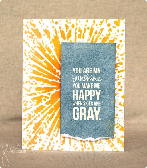
I pulled out my SSS stamps hoping inspiration would strike. Nothing. So, I followed the advice of a well-known and very savvy stamper, Jennifer McGuire. I did a Google search on the name of one of my sets and looked at images of what others had done with this particular set. I was struck by this card:

Simon Says Stamp Wednesday Challenge: Anything Goes, Memory Box | shurkus.com

I liked the white text on a gray panel against the bright yellow on the background. Using someone else's work as inspiration (in the cardmaking world) is known as CASE. Sometimes this is known as Copy And Steal Everything, but some prefer Copy And Share Everything (I'd rather think of it that way, too!). As Solomon said, there is nothing new under the sun!

Here's my card:


I started my card with a piece of watercolor paper. For the green in the color sample, I chose to use an old jar of Lumiere paint. This paint is old and has become quite thick, but it worked beautifully to spread through some stencil waste to create the green dots in the background. I did this in a random way to create interest, color and texture. After that dried, I painted over the panel with various shades of yellow watercolor and let that dry. 

Just as my inspirational stamper did, I white embossed the sentiment on white cardstock. I colored over it with Pumice Stone distress ink, using a blending tool. I dripped some water over that and let the water react with the ink. Distress ink is great for this technique! I mounted this panel onto some black cardstock and sewed around the edges with black thread. 

After trimming the edges of my watercolor paper, I used plenty of adhesive to tape it to a black cardstock base. The sentiment panel went on top of that using 3m foam tape for a little extra dimension. As a final touch, I glued down a bright orange butterfly punched from some thick textured cardstock - the same cardstock I mentioned here.

I love the finished result. This is such a sweet saying, and it means even more to me because my daughter sings this to her children. They love it, and I love hearing her sing it to them. I have enjoyed singing it myself on the occasions when I've had the opportunity to put them to bed. Makes me want to dash down there for a visit!!

Till next time,

Immi


Monday, September 15, 2014

Challenge: Rock the Techniques

Today's challenge on Simon Says Stamp is to feature a project using the technique of your choice. I've decided to post a card I made using watercolors and liquid frisket. If you aren't familiar with it, frisket is used to mask off areas in order to retain the white paper before doing any watercolor painting. I got this idea from an online class called Watercolor for Cardmakers. I haven't done too many of the lessons yet, but I'm enjoying what I'm learning and having fun playing with paper and watercolor.

Here's my card:

I stamped the "thanks" greeting (Stampin' Up!) with black ink and made sure it was completely dry. I painted over it with frisket. After the frisket was dry, I then blobbed on (highly technical term) some watercolors. I added a few splatters and let everything dry. When I peeled off the frisket, the stamped image was still nice and clean underneath. Simple and fun. I mounted the watercolor paper on a pink card base and that was that!

Happy crafting!
Immi

Tuesday, June 24, 2014

Challenge: I ought to use this more!

The Monday challenge for this week from Simon Says Stamp is to do something or use something that has been "neglected" for a while.

I decided to post a card I made for Operation Write Home that uses a stamp I've had for a long time, but haven't used much lately. It's part of a Stampin' Up! set that I still like a lot. I have to be in the mood for coloring to use it - it lends itself really well to watercolor.


The background is made from a couple of pieces of paper, stitched together on my sewing machine. The bird image is stamped on a plain old shipping tag with black Archival ink. I added color with a small watercolor set. The blotchy color on the tag background was done by pressing the tag repeatedly onto some of the watercolor which I'd dabbed onto my Ranger craft sheet. I also used a marker with a weird little tool called (I think) an ink spritzer. I've had mine for years, and I notice that now they are back in vogue! The spritzer forces air past the tip of the marker, which adds tiny little bursts of ink dots. I added some color to the edge with Distress ink and a blending tool, and attached the kraft colored heart from a cheapo set of stickers I think I picked up at the Dollar Spot at Target.

Even though there is a lot going on here, it really was fairly quick and easy - just the way I like it!

Happy crafting!
Immi

Saturday, June 21, 2014

Mission: Stash Reduction - Belated Father's Day

Hi, all. Although Father's Day has come and gone, I did make some cards that I sent off to Operation Write Home that I meant to post. I am still working my way through papers that I'd like to use up, and enjoying stamps I haven't touched in a while. Here's a sample of some cards I made.


These cards are part of a larger group of miscellaneous cards I made using up a sheet of dimensional white letter stickers, called "Thickers". I'd had them so long that the adhesive on the back of the letters wasn't very good anymore, but I hated to throw them away. So I laboriously put drops of a strong liquid adhesive on the backs of the letters, then weighted each card down with books. (I keep a box full of old telephone books just for this purpose.) I always put a sheet of waxed paper between the project I'm drying and the book so that if any adhesive leaks out, it won't make my project stick to the book. Although it took some time, I was very pleased with the results of the white letters against darker backgrounds. Can you tell that I cheated on the second card and used "p" stickers upside down in place of "d"?


The next two cards make use of some Stampin' Up! sets I have. I stamped with Ranger Archival Ink (it won't bleed when it comes in contact with water) and used a brush loaded with inks diluted with water to color the images. Very quick, easy, and I love doing it!

I hope some of our military personnel enjoyed sending these cards home.

Till next time,
Immi

Monday, May 19, 2014

Challenge: Botanical

The Monday Challenge Team over at Simon Says Stamp issued a challenge today with a botanical theme. There are some really nice samples of artwork created by the team members. I decided to make a card to answer the challenge.


I started with the Watercolor Garden set from Stampin' Up. I wanted to try to create a garden scene or a bouquet of flowers, but I've never had success at that type of stamping. I ended up creating a background, though, that I really liked. I used  Distress Inks on my stamps and lightly misted them with water before stamping on the paper, creating a slightly watercolored effect. It really didn't look like much until I added a script stamp, also from Stampin' Up! on top of the flowers. I used Distress Ink in Vintage Photo which is quite dark, also spritzing with water before stamping. I am very happy with the way the water blurred the script - I just think it's a cool look.

I cut a couple of very thin strips of brown to "frame" the stamped paper, and mounted everything on a green cardstock base. The sentiment is from a Tim Holtz set, called Simple Sayings. After cutting my strip of cardstock with notched ends, I added Distress Ink in Worn Lipstick using a foam blender, I also used a little Tea Dye Distress Ink over that. I mounted the sentiment strip on a piece of mustard colored cardstock and notched the ends. I glued it to the card front at an angle, and then added the punched bird, using a tiny bead for the eye. I will admit that I'm not too thrilled with the bird, but what's done is done!

Till next time,

Immi

Wednesday, May 14, 2014

Challenge: Cure for the Monday Blues

I stumbled across another card challenge this week and decided to participate. This involved taking inspiration from an image provided in the blog post. Apparently, this is a regular feature on this blog, and I thought it would be fun to play along. Here's the image:

The colors alone are enough to cure Monday blues! I knew right away that I wanted to incorporate a lot of white space with the yellow stripe at the top. I also wanted to include the pink and turquoise and somehow use circles. Here's what I did:


I started with watercolor paper, and used Distress Ink in Squeezed Lemonade with a little water to paint the yellow stripe across the top. I roughed up the edges of the paper with my Tim Holtz distresser. The flower image was stamped on a piece of white cardstock and colored with pencils. The dots are stamped with some old-school Stampin' Up! inks. I mounted the stamped panel on some matching turquoise cardstock, then adhered it to the watercolor panel. That was then mounted on a pink cardstock base. The sentiment was stamped on a scrap of white cardstock with the ends notched to make a banner. That was mounted on yellow and put on top of the card with some dimensional adhesive dots to make it stand up a little from the card base.

I am quite happy with the way it turned out - I love the bright colors! It was also an interesting experience for me to look for inspiration in an image that had nothing to do with stamping. I enjoyed the whole thing, from beginning to end!

Happy crafting!
Immi


Monday, May 12, 2014

Challenge: M

I enjoy following several blogs to learn from what others are doing. It's a great way to find out about techniques or new products (although that can be dangerous to the pocketbook!).

Simon Says Stamp issues a new challenge every Monday. Today's challenge is to create something inspired by the letter "M". I thought it would be fun to participate, and decided to work with a favorite ink/paper color from my Stampin' Up! days called "More Mustard". I don't know if it's even currently being produced any more, but I still have my ink pad and some of the paper left. It's a great color that plays well with other colors or stands alone, too.


I decided to make a card, using More Mustard card stock as the base. I used a Tim Holtz stencil, aptly named "Honeycomb" with his Distress Ink in Scattered Straw to create an interesting design on the card front. I stamped a sunflower in black Archival ink by Ranger, then used Stampin' Up! reinkers in More Mustard, Summer Sun, Cameo Coral, Garden Green, Mellow Moss & Lovely Lilac with a water brush to create a watercolor look. I added some additional depth with colored pencils once that was dry. And, just for fun, I used my Wink of Stella glitter pen on the butterfly and flower center for a little sparkle. The watercolored panel was mounted on some pink card stock and then I added the sentiment from a Tim Holtz stamp set.

This was a fun card to do, and I enjoyed having a starting place with the challenge.

Happy crafting!

Immi

Friday, February 21, 2014

Playing with Watercolor

I had some fun today visiting several blogs on a blog hop featuring the new spring releases from Simon Says Stamp. I enjoyed seeing all the different ways the artists used the new items. Several of the blogs featured videos showing how the cards were made. One of those bloggers, Kristina Werner, used a technique I wanted to try right away (follow the link if you'd like to see her video). Although it's not a new technique, I hadn't worked with it before, but I found it to be easy and fun. 

Here's what you need for the technique:

Press the ink pads down on the craft sheet to leave some of the color on the surface. Spray liberally with water; then begin pressing the watercolor paper down into the ink. Dry with a heat gun or allow to air dry, then continue pressing the paper down into the inks to get a beautiful, multicolored look.

I used some of my Sizzix dies to cut out shapes, then made several cards. Since the watercolor paper is heavy, I find that I need a heavier adhesive to get it to stick well to the card. I would recommend either Glossy Accents by Ranger or Diamond Glaze by JudiKins. They both are excellent as a strong adhesive or to add a shiny, glossy coat to an embellishment.


Here are the cards I made this afternoon:


All these cards are destined for Operation Write Home, to be sent to American troops for them to use as mail home to family and friends.

Happy crafting!
Immi