Showing posts with label Cardmaking. Show all posts

Tuesday, August 11, 2015

Unity Stamp Challenge

The current challenge at Unity Stamps is about to end, so I'm barely going to get this posted in time to participate.

As shown on their blog, here is the starting point. Participants can choose to follow the color scheme or layout as loosely as they like. I thought the color scheme was great, and I liked the card layout as well. I recently purchased the stamp set (Butterflies & Sunbeams) featured in the layout, so I decided to use that.


Here's my interpretation:


I stamped the heart & butterfly image on watercolor paper using Black Archival ink. The coloring was super simple with watered down inks and a paintbrush. The inks I used on the butterflies are Distress Picked Raspberry and Dried Marigold (I combined the two for the largest butterfly.) The heart is a combination of Distress Spun Sugar and Tea Dye. The ink splatters are Picked Raspberry & Dried Marigold.

Once that was dry, I stitched the panel to a piece of black paper with gold script I had in my stash. I didn't do the neatest job the first time around on the stitching, so I went around again, deliberately making it look at little wonky. Now no one can tell where I messed up the first time!

The card base is white cardstock, stamped repeatedly with one of the sentiments from this stamp set, using Creamy Caramel ink from Stampin' Up! Between the black paper and the card base, I layered a piece of pink patterned paper from a 6 x 6 Colorbok pad called Light Bright.

The sentiment at the top was stamped on a scrap of watercolor paper with Versafine Onyx Black and heat embossed with clear embossing powder. I used some of the Picked Raspberry & Dried Marigold to color it, and stitched one end with black thread. I notched the opposite end, and used Distress Black Soot to go around the edge.

I hope your week is going well. I'll be back at work beginning next week - this summer has flown by!

Till next time,

Immi


Tuesday, June 30, 2015

Unity Stamp Challenge

I've got a card today that was inspired by the current Unity Stamp Challenge. My card is loosely based on the card sketch they provided.


Here's my interpretation:


I started with a piece of watercolor paper, and stamped the bicycle image (Reasons to Smile by Unity Stamp) with Versafine Onyx Black. I covered the wet ink with clear embossing powder and heat set it.

Next I pulled out several color of Distress inks and rubbed some of the color on my non-stick craft sheet. Using water and a brush, I applied the inks in a watercolor style. I set it aside to dry while I worked on the card background. (After it was dry, I rounded the edges with a Corner Chomper and stitched it to piece of gray cardstock.)

I thought it would be nice to have the effect of rays of sun coming down from the top left, so I chose the Stripes stencil from Tim Holtz and rubbed Squeezed Lemonade Distress ink through the stencil using an ink blending tool. To mimic the stripes on the card sketch, I used some complementary papers from Vintage Bliss by Simple Stories.

For the sentiment (Big Summertime Bouquet by Unity Stamp), I blended Tumbled Glass Distress ink on a scrap of white paper, then stamped the image with Versafine Black and heat embossed the same way I did the bicycle. I cut the strip with notched ends, and layered it on a scrap of black cardstock. 

Everything was layered on the card base with adhesive - for the smaller pieces, I find it easier to use glue.

Happy crafting!

Immi


Sunday, April 19, 2015

Monochromatic Card

I spent some time this weekend working on a couple of monochromatic cards, inspired by the current Muse  #113 challenge.


I started with a smooth white cardstock panel, and several shades of blue dye ink. I used Simon Says Stamp Audrey Blue, and Stampin' Up! Brocade Blue, Not Quite Navy, and Ballet Blue. I inked up some circle stamps from Hero Arts (Box of Dots) and an old Stampin' Up! circle that was part of a set of shapes. After stamping the circles, I used a hero Arts stamp called Silhouette Burst and stamped it three times with Hero Arts Black dye ink. At this point, I didn't really like what I had and I set it aside to work on something else. 

Later, I spotted a piece of vellum and tried layering it over my stamped panel. I thought it really improved the way it looked. I decided to try finishing the card to see if I could make it work out. I stamped the sentiment (Stamper's Anonymous Tim Holtz Simple Sayings) with Hero Arts Unicorn pigment ink and covered it with white embossing powder. I thought this particular sentiment went so well with the image which reminds me of a dandelion. I'm sure we've all had the experience of making a wish and trying to blow all the seeds off a fluffy white dandelion!

After melting the powder with my heat tool, I cut the strip with a notch on the end and stitched it along with the vellum on top of the white stamped panel. I pulled out my scraps and found three butterflies punched from various scraps of blue cardstock (using a Martha Stewart punch). 

I thought it would be good to gussy them up a little, so I chose a 7 Gypsies stamp set called Lillie that had a couple of different script stamps as well as a music stamp. I did all three butterflies with Stampin' Up!'s Not Quite Navy ink, and glued them down on top of the vellum. For a little extra touch, I coated all three with Glossy Accents - I hope you can see the shine. Here's a closeup:


I'm glad I didn't give up on this card (although I'm not opposed to giving up if it's clearly a lost cause!).

Here is the inspiration card that got me started:


Happy crafting!

Immi


Friday, March 6, 2015

Muse Challenge

I'm excited to say that my Celebration card was chosen as one of the top 3 cards from the Muse #106 challenge! (If you'd like to read the post about this card, click here.)

Each week, a new challenge is posted. Participants must comment on at least three of the entries and vote on their choice. I don't always have time to join in, but it's fun to see what everyone makes based on the challenge card. Here is what I've done for this week after looking at the challenge card:


I selected some papers from a 6x6 pad called  Vintage Bliss from Simple Stories. This makes it much easier to combine patterns, since the designers have done all the work for you - everything coordinates. I layered my paper strips on a dark gray background and stitched them in place with my sewing machine. 

The sentiment is from Altenew (Label Love). I first tried it on white cardstock, but didn't like how it looked so I stamped again on a scrap of the pink polka dot. (I used my favorite ink for stamping sentiments - Versafine Onyx Black.) I trimmed the left edge with pinking shears and cut a notch on the right hand side. This is also stitched down using the sewing machine.

I had a skinny little strip left over from trimming the gray panel, so I experimented with placing it to the left of the main panel with a sliver of my card base showing through. I used tiny little dots of Glossy Accents to glue it down.

Here's the challenge card:


I was inspired not only by the patterned papers, but also the space left for the sentiment. My color scheme is brighter, but I went with a neutral for the background. This card is definitely more about the paper than the stamping. I had fun making it - hope you enjoy seeing it!

Till next time,
Immi


Wednesday, March 4, 2015

Friendship Card

I had an unexpected day off due to bad road conditions, so I enjoyed some cardmaking time today. I have been experimenting with some dies I recently bought and thought I'd put the die cuts to use in a couple of cards. Here's one of them:


 I started with a piece of watercolor paper cut to 4.25 x 5.5. I inked up a Hero Arts background stamp called Dot Flower with several shades of pink and purple Distress inks. After misting the stamp with water, I set the stamp face up on my work surface and placed the paper on top. To ensure that the ink got into the paper, I carefully held in in place while rubbing over the entire surface and also giving it a few seconds to sink into the paper's texture. This made a pretty, multicolored background that is so easy to achieve. I used Extreme Adhesive to attach it to a green cardstock base.

I cut a scrap of lightweight pink paper I had and rounded the corners. Next I cut a piece of white cardstock a little smaller than the pink piece and also rounded  the corners. I rubbed Peeled Paint Distress Stain on my craft sheet and swiped the white paper through the stain to give it that green color. After setting it with my heat tool, I swiped it through the stain still left on the craft sheet. I really like the illusion of depth this creates. I also used the stain to color some white leaves I'd die cut from a Tim Holtz Alterations die called Spring Greenery. I tucked them behind both the green and pink papers and stitched around the edge of the green panel.

The sentiment and flowers are from Hero Arts Trees, Birds, & Messages. They are stamped with Black Onyx Versafine and embossed with clear powder. This layered panel and leaves were attached to the background using dots of Glossy Accents. I also put it under a book for a while to make sure everything stuck well.

I like the combination of colors, and this card fits with a couple of challenges currently going on. I'm linking up with Hero Arts Nature Challenge and Simon Says Stamp Just a Hiint of Clover.

Till next time,

Immi

Monday, March 2, 2015

Distress Watercolor Card

I had some fun trying out a new stamp set from Unity . I particularly like the designs of Phyllis Harris - they are sweet and whimsical. They are also great for coloring techniques. I am such a beginner at coloring of any type; some artists are quite skilled!


I stamped my image on some watercolor paper, using Archival Gray ink which does not bleed when wet. It also provides more softness than stark black. Using several shades of Distress Inks, I would rub the ink pad onto my Ranger craft sheet, then apply to the paper with a wet brush.When I had all the coloring done, I mounted the panel onto a blue patterned cardstock, leaving a wider margin on the right hand side. I tied some thin brown twine twice around both papers and tied it in a simple knot.

Before mounting this panel onto the striped paper, I added several strips of 3M foam tape to the back to help even things out since the twine added some bulk. Then I stamped my sentiment directly onto the striped paper with Hero Arts Black ink. Everything was mounted onto a kraft cardstock base.

Below is the inspirational image from the Unity website; I chose to try to follow this color scheme and will like this up to the current Unity challenge.


Inspiration Image

Till next time,

Immi

Friday, February 27, 2015

Celebration Card

I'm participating in the Muse Challenge #106 this week.


I tried some new (to me) products on this card. The stamp set I used is from Mama Elephant and is called Make a Wish. I stamped my sentiment with Versamark ink and embossed with Liquid Platinum by Ranger. The stars are from the same set, and I tried a couple of newly purchased inks: Simon Says Stamp's Audrey Blue and Hero Arts' Fresh Peach.

The multicolored strip is cut from the Mama Elephant packaging. The colors seemed just right to use with this card. This is a very basic, simple card and it was a great opportunity to test drive some new things. I think this card will end up in a box sent to Operation Write Home.

Here is the inspiration image from the Muse blog:


As you can see, I borrowed multiple elements from this card. The simple panel to the left with all the stamping concentrated towards the bottom and also the stamping on the far right of the card front.

Happy crafting!

Immi

Tuesday, February 24, 2015

Friendship Card

I'm trying to squeeze more time in for art play in the evenings, and relying on challenges to give me ideas to try. Hero Arts currently has a challenge going with a nature theme. The only rule is to use at least one of their stamps. I decided to try a new stamp set I found on clearance at a local scrapbook store. (Somehow, if it's on clearance, I feel better about buying it!)


I started with a watercolor panel and inked it with two Distress Inks - Worn Lipstick and Wild Honey. I applied each color with a blending tool from the opposite edge, allowing them to blend together in the middle. I love the way the colors look together!

I stamped the floral design twice with Versamark ink and sprinkled it with Wow Opaque Bright White Super Fine embossing powder. (Since Distress ink stays wet longer than most dye inks, I was careful to heat set the blended ink in the background until it was completely dry. Otherwise, embossing powder would have stuck everywhere.) After heat setting the embossing powder, I stamped the butterfly from the same set (Hero Arts Butterflies & Wildflowers). This time I used Versafine Onyx Black and sprinkled clear embossing powder on top, heat setting afterwards.

The white embossing I'd done earlier really didn't look as good as I'd like in the middle of the stems. I decided to cover my boo-boo with a vellum strip. I used the Mini Scallop & Pinking die from Alterations to cut a scalloped edge on both sides of my strip. Then I stamped my sentiment from Hero Arts Friends, using Versafine Onyx Black. I used clear embossing powder again and heat set it. Since vellum is always tricky to adhere without seeing the adhesive through it, I chose to stitch it down with my sewing machine and white thread. I think this did a pretty good job of disguising my less-than-perfect stamping. I always try to find a way to salvage my work!

The watercolor panel was mounted onto a plain white card base and that was that! It was a fairly quick project and I'm happy with the way it looks.

Happy crafting!

Immi

Friday, December 12, 2014

White Stamping

I'm participating in the Craft Stamper Magazine's Make It Take It Challenge for December. The requirement is to stamp in white. I thought it would be fun to do a "chalkboard" card. This is a fun technique that's been around for a while, although I've just recently tried it. I always seem to get on the trend bandwagon late!

Here's my card:

"Chalkboard" Santa


I used a stamp set I've had for a long time from Stampin' Up! called "Christmas is Here". Before stamping, I prepped my cardstock (plain smooth black) with antistatic powder to help prevent embossing powder from getting all over. I stamped the image and saying using Hero Art's Unicorn White pigment ink. Then I poured white embossing powder over it and heat set it. After it cooled a little, I had some fun coloring the design with colored pencils. Then I used a foam pad dabbed with the white pigment ink to smear "chalk" over the surface of the stamped panel. As a final touch, I used a ruler to draw lines with a white pencil around the perimeter. I mounted the panel to some festive striped paper and then mounted it to a top-folding white card base.

It's been fun to do some experimenting with this technique lately. It's quick and easy  - I did quite a few gift tags for Christmas presents, too, with smaller and simpler designs.

I hope you are enjoying this special time of year!

Immi

Friday, November 14, 2014

Muse #93

I had fun this week taking inspiration from the card posted on the Muse blog.


I took away a couple of things from the original card: the simple shape of the tree and the "jewels" adorning it. 

Using Strathmore Bristol, I inked the paper with green Distress Inks, flicking some water droplets on top after heat setting it. I trimmed out my tree shape and set it aside.

For the background, I wanted to try to imitate a night sky. There are several good tutorials out there, and after watching a couple, I pulled out three shades of blue Distress Inks. These blend really nicely on the smooth surface of the Bristol paper. After heat setting, I decided to try to deepen the colors and was really amazed at how much more intense I was able to make it. I love the way that Distress Inks blend with each other!

I used a couple of different products to imitate the starry sky - the effect I like the most was simply dotting on Iridescent Medium by Liquitex.

I glued down some sequins onto my tree and was happy to find that I had a star shaped sequin for the tree top. The tree trunk was cut from some brown paper in my scrap drawer. Now that I think about it, the only stamping on this card is on the sentiment banner. I don't know the name of the set that the word came from, but the little red stars are from a Hero Arts set called "Birthday Messages". I used Stampin' Up! ink in Real Red for the stars and also to run around the edge of the banner.

Here is the original inspiration card:

Muse #93

I hope you have a great weekend!

Immi

Wednesday, November 12, 2014

Getting in the Holiday Mood

I have a couple of projects to share for this week's Monday challenge from Simon Says Stamp.

First is a card I made, inspired by this card.


I started with a kraft cardstock panel. I stamped the sentiment first to be sure that the snowflakes would fit around it. I combined snowflakes from multiple sets (Stampin' Up! and Inkadinkado) so that each one would be different. I used a silver pigment ink and covered that with silver embossing powder. After heat setting, I wanted to use some kind of thread or ribbon to make the snowflakes look like hanging ornaments. I remembered that I had some thin silver cord, so I tried that. I put down tiny dots of Glossy Accents to hold the ornament strings in place, then tied teeny little bows and glued them above each snowflake. I put a heavy book on top until everything dried. Then I wrapped the cord to the back of the panel and taped it down. The stamped panel was mounted onto a navy card base. I was surprised how quickly this came together. In retrospect, though, I don't know if I'd use the silver with kraft again. I'm not sure there's enough contrast. Live and learn, I guess.

Next is an ornament:


To make this, I cut a scalloped circle from watercolor paper using a die set from Spellbinders. The stamp I used is an old one from Stampin' Up! that I've had for many years. I used Versafine Black Onyx ink and embossed it with clear embossing powder. To color the image, I used Distress Inks diluted with water and some Stampin' Up! markers in a few spots.

I cut three more scallops and glued them all together, using a book to weight it down until dry. I decided to run a Versamark marker around the edges and dip them in silver embossing powder. I really like the way that turned out. Then I used a bookbinding tool to punch a small hole in the top and used some of that thin silver cord to make a hanging loop.

That's it for now. I hope your week is going well!

Immi


Tuesday, November 11, 2014

Take It, Make It Challenge : November

The November Make It Take It challenge from Craft Stamper Magazine just about had me stumped. The challenge is to use non-Christmas themed stamps to create a Christmas or holiday card. I enjoyed seeing the examples from the Design Team, but I was drawing a complete blank. And then...it came to me! Alphabet stamps in the shape of a tree! Now I was getting excited to see if I could make it work.


I knew I would need to use a clear stamp set so that I could see exactly where each stamp was being placed. I pulled out Typewriter Alphabet by Stampendous which I thought would be about the right size. I tried at first to stamp each letter individually, but I quickly saw that it would be very uneven and messy looking. I decided I would use a stamp press, and tried laying the stamps out on a piece of paper but they kept getting bumped out of position. (Insert sounds of frustration.)

I finally figured out that I needed to arrange them directly on the stamp press so that they would stay put until I had them all in position. Ahh! That's much better! I stamped them on my paper and then used some low tack tape to mask off a triangle around the "tree". I heat set it to be sure it was dry and began blending some Distress Ink in Evergreen Bough over the letters. To my dismay, the letters began smudging. Blech!

So, determined to make it happen, I turned the paper over and taped off my triangle area again. I blended the Distress Ink over it and decided to flick a little water over the surface to create some lighter spots. After drying the paper, I inked up the letters again and stamped - much better this time!

Next I took a small stamp that looks like an asterisk and stamped in Stampin' Up! Real Red randomly over the tree. I cut it out and brushed the edges with some more Evergreen Bough and a little Vintage Photo.

Next up, the background. I took another sheet of paper - by  the way, I used Strathmore Bristol for this project - and inked the entire thing with Tumbled Glass Distress Ink. After heat setting, I used the little asterisk along with a couple of others to stamp "snowflakes" with Versamark. I poured some sparkly embossing powder over them and heat set again. It's hard to see in the photo, but the snowflakes have some nice sparkle to them.

I cut a scrap of white to make a hill for the bottom of the card, along with a scrap of brown for a tree trunk. I stitched the hill down and used adhesive for the tree and trunk. I had a little silver star in my stash that I glued above the tree with Glossy Accents so it won't budge.

Finally, I colored some scrap white cardstock with Festive Berries Distress Ink and stamped the sentiment which is from a new set called Winter Wonderland from Walter & Winnie. The sentiment comes as a single line, but since it's a clear stamp I was able to cut it apart and stamp it as a two-line sentiment. That fit my card better. I cut the strip of paper in a banner shape and adhered it down to the background panel. The entire panel was then adhered to a top-folding white card.

I'm happy that I was finally able to come up with something for this month's challenge. Hope you enjoyed  it!

Immi

Monday, November 3, 2014

Challenge: Anything Goes

Last week, the Wednesday Simon Says Stamp challenge was the wide open theme of "Anything Goes". I had just made a card  that I thought would work for this challenge, but today is the first chance I've had to post it.


This came about as a result of an experiment. I had seen a technique that I thought looked interesting and wanted to give it a try.

I took some off-white cardstock and, using a brayer, layered Distress Ink in Mustard Seed and Barn Door. I then spread on some acrylic medium by Golden called Coarse Garnet Gel. If you look closely, you can see bumpy spots, which are the grit embedded  in this gel. The grit is a dark red color, while the body of the medium is clear. I had no idea how this would turn out, but I thought it was very interesting. The colors of the inks stayed true and were even intensified, and the grit in the gel added texture. I left it to dry overnight - the next morning it was dry but the cardstock was rather flexible. I wasn't sure what to do with it at that point, but I decided to make a card background with it. I trimmed a little off the edges and adhered it to a green card base.

The pear stamp is an oldie from A Stamp in the Hand. It's a very solid image with little detail, so it works well for blending colors. I used several Distress Ink colors in the mini pads and then spritzed it with water. I stamped onto some watercolor paper and added a few splotches of color with watered down ink.

I trimmed it pretty close, tearing the bottom edge of the panel and mounted it onto some dark brown paper. I added some foam adhesive (3M) to the back and set it aside for a moment. I cut a length of twine and looped it around my fingers, then placed it on the card front with the foam mounted pear panel on top. The foam adhesive holds the twine in place.

The "happy birthday" sentiment is from Altenew's Label Love (I'm using that set a lot lately!). I've discovered that these stamps work best for me if I stamp on a surface with a little give, like a pad of paper. I used a teeny bit of foam adhesive on the far right side of the sentiment strip to bring it up to the level of the pear panel. Otherwise it would have been hanging in mid-air and probably would have gotten bent out of shape.

I thought the card still needed a little something, so I found a dark brown button and threaded it with a little gold metallic thread, then glued it on with some Glossy Accents.


This next card has nothing to do with the challenge, but it's so similar I thought I'd include it. The background was made with a checkerboard stamp, inked with Distress Ink and misted with water. It was stamped on some watercolor paper and trimmed a little smaller than the card base.

The pear was done exactly the same as the previous card and also mounted on dark brown paper. I wrapped some twine around the checkerboard panel, and added a die cut "p" just for fun.

That's it for today. I hope your week is off to a good start!

Immi

Monday, October 27, 2014

Challenge: Get Crafty & Use Kraft

Here is my submission to the Wednesday Simon Says Stamp challenge - Get Crafty & Use Kraft. I love the look of kraft cardstock so this was a fun challenge.


I used one of my favorite flower stamps from Stampendous, stamping in Versamark and heat embossing with white. I colored in the flowers using Inktense pencils and a wet brush, which went very quickly. The embossing makes it easy to "stay in the lines".

The sentiment is from Altnew's Super Script 2. I stamped in black ink and trimmed it closely. I brushed on clear Wink of Stella and added Glossy Accents on top, then set it aside to dry. 

Meanwhile, I cut a piece of lace edging and taped it down to the back of the kraft panel. I stitched around the entire panel using my sewing machine, then adhered a thin strip of green ribbon at the bottom. This panel was attached to a pink card base, then the sentiment was glued on top of that.

I hope your week is off to a good start! Happy crafting!
Immi


Thursday, October 23, 2014

Make it Take it Challenge: October

So, I'm a little late joining this party, but I'm going to get this squeezed in by the deadline. This is a challenge from Craft Stamper Magazine. I'm not very familiar with it, but discovered it because it was mentioned on a blog I was reading. Every month they issue a new challenge - this month, participants are to use the technique of multi-color stamping. This involves using mulitple colors of ink, paint, etc. on an image.

Here's my card:


I pulled out a leaf stamp by Rubber Nature ArtStamps and started adding various colors of orange and brown Distress inks. After giving it a light misting of water, I stamped that on a cardstock panel. Then I stamped it again on another, lightweight piece of paper and cut it out to make a mask. I put the mask over my leaf, and inked up an old favorite script stamp from Stampin' Up! in various shades of green Distress inks. I stamped the script on top of the masked leaf, and then removed the mask. This left the leaf image untouched, with the script all around it.

So far, so good. I trimmed the panel down a little, and mounted it to some dark brown paper which was product packaging I'd saved. I pulled out some multi-hued thread and wrapped it around the top of the panel several times, securing it to the back with tape.

Next I pulled out Altenew's Label Love set and chose "thank you". I tried several brown inks before settling on a very old Ancient Page ink in Close to Cocoa (Stampin' Up!). I poured clear embossing powder over that and heat set it. I trimmed it close to the stamped image, leaving some of the white around it as a frame. I tried that on the card front, but I felt that it needed something dark behind it to provide sufficient contrast to the panel behind it. Brown didn't seem to be the right choice, but I thought a rust color would work. I inked up some paper using Distress Ink in Rusty Hinge, creating my own colored paper. I adhered the sentiment to this and trimmed it, leaving a thin edge of color showing. This was added, and that was that - all done!

Happy crafting!
Immi

Monday, October 20, 2014

Challenge: Anything Goes

Hi! I'm back with another Simon Says Stamp Monday challenge. My card was inspired by a recent post from Simon Says Stamp. Here's the original by Shari Carroll:

Shari Nov card kit D1

I really liked the layered paper banners, and the offset cut of the largest paper panel. I pulled out some papers from a 6 x 6 pad from My Mind's Eye. The nice thing about paper collections like this is that all the papers are designed to coordinate with one another; this simplifies things when using multiple prints together.

The hot air balloon image is also from My Mind's Eye, while the "hi" sentiment is from Simon Says Stamp. The red ink is from a REALLY OLD ink pad from a collaboration between Stampin' Up! and Ancient Page. (Some of my supplies are getting pretty ancient.)

This was pretty quick to put together. I did fussy cut the sentiment and balloon (not my favorite thing, but I like the way it looks), and ink the edges of the banner behind the sentiment. Just for fun I mounted the sentiment and balloon using foam tape to give some dimension to an otherwise flat card. Other than that it was just arranging and adhering layers of paper. I also used a 1/2" corner rounder from Crop-A-Dile on the upper right corner.


Wednesday, September 17, 2014

Simon Says Stamp Flickr Group Challenge

I recently learned about a Flickr group designed to showcase what others are doing with Simon Says Stamp products. I have a few of their stamp sets, so I thought it would be fun to participate. The group has just started posting regular challenges as prompts for members to use.

The first prompt is a color scheme. The instructions state that at least three of the five colors should be used. When I first looked at it, I really had no idea what to do with those colors. These are not colors I would typically work with, but that's part of the challenge.


Color Challenge Inspiration by Simon.Says.Stamp

I pulled out my SSS stamps hoping inspiration would strike. Nothing. So, I followed the advice of a well-known and very savvy stamper, Jennifer McGuire. I did a Google search on the name of one of my sets and looked at images of what others had done with this particular set. I was struck by this card:

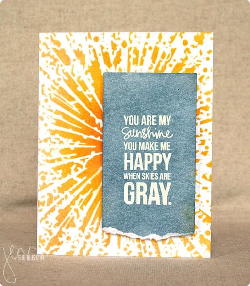
Simon Says Stamp Wednesday Challenge: Anything Goes, Memory Box | shurkus.com

I liked the white text on a gray panel against the bright yellow on the background. Using someone else's work as inspiration (in the cardmaking world) is known as CASE. Sometimes this is known as Copy And Steal Everything, but some prefer Copy And Share Everything (I'd rather think of it that way, too!). As Solomon said, there is nothing new under the sun!

Here's my card:


I started my card with a piece of watercolor paper. For the green in the color sample, I chose to use an old jar of Lumiere paint. This paint is old and has become quite thick, but it worked beautifully to spread through some stencil waste to create the green dots in the background. I did this in a random way to create interest, color and texture. After that dried, I painted over the panel with various shades of yellow watercolor and let that dry. 

Just as my inspirational stamper did, I white embossed the sentiment on white cardstock. I colored over it with Pumice Stone distress ink, using a blending tool. I dripped some water over that and let the water react with the ink. Distress ink is great for this technique! I mounted this panel onto some black cardstock and sewed around the edges with black thread. 

After trimming the edges of my watercolor paper, I used plenty of adhesive to tape it to a black cardstock base. The sentiment panel went on top of that using 3m foam tape for a little extra dimension. As a final touch, I glued down a bright orange butterfly punched from some thick textured cardstock - the same cardstock I mentioned here.

I love the finished result. This is such a sweet saying, and it means even more to me because my daughter sings this to her children. They love it, and I love hearing her sing it to them. I have enjoyed singing it myself on the occasions when I've had the opportunity to put them to bed. Makes me want to dash down there for a visit!!

Till next time,

Immi


Monday, September 15, 2014

Challenge: Rock the Techniques

Today's challenge on Simon Says Stamp is to feature a project using the technique of your choice. I've decided to post a card I made using watercolors and liquid frisket. If you aren't familiar with it, frisket is used to mask off areas in order to retain the white paper before doing any watercolor painting. I got this idea from an online class called Watercolor for Cardmakers. I haven't done too many of the lessons yet, but I'm enjoying what I'm learning and having fun playing with paper and watercolor.

Here's my card:

I stamped the "thanks" greeting (Stampin' Up!) with black ink and made sure it was completely dry. I painted over it with frisket. After the frisket was dry, I then blobbed on (highly technical term) some watercolors. I added a few splatters and let everything dry. When I peeled off the frisket, the stamped image was still nice and clean underneath. Simple and fun. I mounted the watercolor paper on a pink card base and that was that!

Happy crafting!
Immi

Friday, September 5, 2014

More Alcohol Ink Cards

As promised, here are some additional cards I did that utilized alcohol inks. These all use the same cool filmstrip stamp by PaperArtsy. They all have a similar feel with lots of fun layers of miscellaneous papers. All three also feature the same "missing you" stamp from Tim Holtz.


The first card doesn't have much stamping - only the sentiment and the filmstrip image. The rest of the color and interest comes from layers of paper.


The next card also has some stamping along the purple cardstock (a border stamp - unknown) and along the gold cardstock to the left (Technique Tuesday). The panel of text is from an old book.


Finally, the last card also has limited stamping - again, the filmstrip and the sentiment. The alcohol ink background makes a stronger statement here. 

That's it for now. I enjoyed making these and sharing them with you.

Happy crafting!

Immi


Tuesday, September 2, 2014

Alcohol Ink Cards

Whew! I can't believe that it's already September. Looking back, I see that it was July since I last posted, but in my defense I've had a lot of great family stuff going on.

I thought I'd share some cards I did using alcohol inks. I don't get these out very often - they can be messy, and I am limited in the techniques I've learned for them. I do love the cool backgrounds that can be created with them, so here goes.


This first card has a bright and bold background created with alcohol inks on glossy cardstock (all the cards I'll show use glossy cardstock). The cute little partygoers is a stamp from Prima. The "happy birthday" is from a Tim Holtz set. I did a little simple watercoloring with dye inks on the kiddos' clothing, and mounted the panel on some bright orange cardstock. One of these days, I'm going to run out of that cardstock and I will be so sad. It's actually leftover covers from a planner made one year at the high school where I worked. Rather than toss them in the recycle bin, I brought them home - the color is great and the paper has a cool texture to it.


This next card is more subdued, and I used some metallic mixative along with the inks which gives it a pearlized sheen - very pretty! I stamped a large leaf (Rubber Nature ArtStamps) along with the "hello" sentiment (Jillibean Soup) and mounted both on some gray cardstock I ran through my Sizzix with an embossing folder to give it that raised text.


This card with the sweet bird shows another bright alcohol ink background, but just a little strip of it. I like the way it adds some great color to a black & white stamped image. The card front is stamped with a French script stamp (Hero Arts), a flourish (unknown), and a great scattered dot stamp I've had for years (Stampin' Up!).

One more...

This one might have been better with a less busy background, but I do like the combination of colors. The gorgeous flower arrangement is a stamp by Prickley Pear. I should try coloring it with watercolor someday.

I've got a few more cards that I'll post later - they all feature the same stamp.

Till then,

Immi