Showing posts with label Glossy Accents. Show all posts

Sunday, April 19, 2015

Monochromatic Card

I spent some time this weekend working on a couple of monochromatic cards, inspired by the current Muse  #113 challenge.


I started with a smooth white cardstock panel, and several shades of blue dye ink. I used Simon Says Stamp Audrey Blue, and Stampin' Up! Brocade Blue, Not Quite Navy, and Ballet Blue. I inked up some circle stamps from Hero Arts (Box of Dots) and an old Stampin' Up! circle that was part of a set of shapes. After stamping the circles, I used a hero Arts stamp called Silhouette Burst and stamped it three times with Hero Arts Black dye ink. At this point, I didn't really like what I had and I set it aside to work on something else. 

Later, I spotted a piece of vellum and tried layering it over my stamped panel. I thought it really improved the way it looked. I decided to try finishing the card to see if I could make it work out. I stamped the sentiment (Stamper's Anonymous Tim Holtz Simple Sayings) with Hero Arts Unicorn pigment ink and covered it with white embossing powder. I thought this particular sentiment went so well with the image which reminds me of a dandelion. I'm sure we've all had the experience of making a wish and trying to blow all the seeds off a fluffy white dandelion!

After melting the powder with my heat tool, I cut the strip with a notch on the end and stitched it along with the vellum on top of the white stamped panel. I pulled out my scraps and found three butterflies punched from various scraps of blue cardstock (using a Martha Stewart punch). 

I thought it would be good to gussy them up a little, so I chose a 7 Gypsies stamp set called Lillie that had a couple of different script stamps as well as a music stamp. I did all three butterflies with Stampin' Up!'s Not Quite Navy ink, and glued them down on top of the vellum. For a little extra touch, I coated all three with Glossy Accents - I hope you can see the shine. Here's a closeup:


I'm glad I didn't give up on this card (although I'm not opposed to giving up if it's clearly a lost cause!).

Here is the inspiration card that got me started:


Happy crafting!

Immi


Saturday, March 21, 2015

Muse Challenge #109

I had some time this morning to play around, so I thought I'd try my hand at the latest Muse Challenge. Here's my take:

Muse Challenge #109

Here's the original challenge image:


I loved the yellow background contrasting with the bright blue, the placement of the stamped image, and the Polaroid-style frame. Such a cheerful card!

I started with a piece of smooth white cardstock and blended Distress Inks in Squeezed Lemonade and Mustard Seed over the surface. Then I misted a little water over that and blotted it off. I also like the darker specks of color in the inspiration card, so I put a little Lemon Zest Dylusions spray on my craft sheet and diluted it with water. Then I picked up the color with a small paintbrush and flicked it over my paper. Since I ended up trimming the paper down quite a bit, all that detail doesn't show up in the finished card, but I enjoyed doing it anyway.

I chose an old stamp from a Stampin' Up! set called Nice & Easy Notes and stamped it in black Archival ink on a scrap of watercolor paper. I used Distress Markers in Spun Sugar, Picked Raspberry, Spiced Marmalade, Mowed Lawn, Broken China, and Stormy Ocean to add color to my stamped image. Then, with a wet brush, I blended the colors and dried everything with a heat tool. I added some splashes of yellow over the top, using the same method described above. I used a square punch and a paper trimmer to create my pink "Polaroid" frame, and glued the watercolored image behind it. Then I mounted that onto my yellow paper and trimmed it down. I pulled out a fun printed paper I had in my scrap bin - I wish you could touch it, as the pink flowers are flocked. That was trimmed a little smaller than the turquoise card base and everything was mounted with a tape adhesive.

I had a  scrap of blue glitter cardstock that I punched with my favorite Martha Stewart butterfly punch. That has to be one of  the best purchases I've made - I've used that same punch so many times, and I never get tired of it! I decided that I wanted the blue flowerpot to match the butterfly and turquoise cardstock a little better, so I used a Stampin' Up! marker in Tempting Turquoise to add some additional color, blending with a wet brush. At first I was wasn't sure about the green color that it created when blended with the Distress Inks I'd used earlier, but I really like the finished result. I think it has more depth and interest than before - glad that one turned out okay!!!

For one final touch, I added some Glossy Accents to the flowers - here's a closeup:

Glossy Accents Closeup
Have a great weekend!

Immi


Friday, March 6, 2015

Muse Challenge

I'm excited to say that my Celebration card was chosen as one of the top 3 cards from the Muse #106 challenge! (If you'd like to read the post about this card, click here.)

Each week, a new challenge is posted. Participants must comment on at least three of the entries and vote on their choice. I don't always have time to join in, but it's fun to see what everyone makes based on the challenge card. Here is what I've done for this week after looking at the challenge card:


I selected some papers from a 6x6 pad called  Vintage Bliss from Simple Stories. This makes it much easier to combine patterns, since the designers have done all the work for you - everything coordinates. I layered my paper strips on a dark gray background and stitched them in place with my sewing machine. 

The sentiment is from Altenew (Label Love). I first tried it on white cardstock, but didn't like how it looked so I stamped again on a scrap of the pink polka dot. (I used my favorite ink for stamping sentiments - Versafine Onyx Black.) I trimmed the left edge with pinking shears and cut a notch on the right hand side. This is also stitched down using the sewing machine.

I had a skinny little strip left over from trimming the gray panel, so I experimented with placing it to the left of the main panel with a sliver of my card base showing through. I used tiny little dots of Glossy Accents to glue it down.

Here's the challenge card:


I was inspired not only by the patterned papers, but also the space left for the sentiment. My color scheme is brighter, but I went with a neutral for the background. This card is definitely more about the paper than the stamping. I had fun making it - hope you enjoy seeing it!

Till next time,
Immi


Wednesday, March 4, 2015

Dot Flower Background

Here's the second card I made today (to see the first, click here).


This card uses the same background stamp - Hero Arts Dot Flower. This time, I stamped with Versamark on white cardstock and embossed with white powder. Then, I used Barn Door, Ripe Persimmon, and Wild Honey Distress inks, applied with blending tools. The embossing resists the ink and stays white - I really like this look! (Here is a link to the image that inspired me.) This was adhered to a white cardstock base.

Next I cut a couple of tags using Tag Collection dies from Alterations. I edged them with some Distress Ink in Peacock Feathers. I also used a couple of vellum die cuts from the Spring Greenery die from Alterations. The blue flourish behind the tags is cut from glitter paper from Die Cuts With a View, using a file that I downloaded to cut with my Silhouette Cameo.

The sentiment is from a small set (I don't remember the name), and is stamped with Versafine Black Onyx and embossed with clear powder. 

The glitter flourish and tag were glued down to the background with dots of Glossy Adhesive. (Before gluing the tag down, I tied a little bit of twine through the hole at the top.) I used a little Matte Medium from Ranger to attach the vellum leaves just at the base of the stem, and also used the same medium to glue down some colorful sequins. Everything was then weighted down under a book for a little while to be sure it dried in place.

I'm linking this card up with the Hero Arts Nature Challenge, the Simon Says Stamp Girly Challenge, and Virginia Lu's All Things Embossed.

Hope your week is going well!
Immi

Friendship Card

I had an unexpected day off due to bad road conditions, so I enjoyed some cardmaking time today. I have been experimenting with some dies I recently bought and thought I'd put the die cuts to use in a couple of cards. Here's one of them:


 I started with a piece of watercolor paper cut to 4.25 x 5.5. I inked up a Hero Arts background stamp called Dot Flower with several shades of pink and purple Distress inks. After misting the stamp with water, I set the stamp face up on my work surface and placed the paper on top. To ensure that the ink got into the paper, I carefully held in in place while rubbing over the entire surface and also giving it a few seconds to sink into the paper's texture. This made a pretty, multicolored background that is so easy to achieve. I used Extreme Adhesive to attach it to a green cardstock base.

I cut a scrap of lightweight pink paper I had and rounded the corners. Next I cut a piece of white cardstock a little smaller than the pink piece and also rounded  the corners. I rubbed Peeled Paint Distress Stain on my craft sheet and swiped the white paper through the stain to give it that green color. After setting it with my heat tool, I swiped it through the stain still left on the craft sheet. I really like the illusion of depth this creates. I also used the stain to color some white leaves I'd die cut from a Tim Holtz Alterations die called Spring Greenery. I tucked them behind both the green and pink papers and stitched around the edge of the green panel.

The sentiment and flowers are from Hero Arts Trees, Birds, & Messages. They are stamped with Black Onyx Versafine and embossed with clear powder. This layered panel and leaves were attached to the background using dots of Glossy Accents. I also put it under a book for a while to make sure everything stuck well.

I like the combination of colors, and this card fits with a couple of challenges currently going on. I'm linking up with Hero Arts Nature Challenge and Simon Says Stamp Just a Hiint of Clover.

Till next time,

Immi

Wednesday, November 12, 2014

Getting in the Holiday Mood

I have a couple of projects to share for this week's Monday challenge from Simon Says Stamp.

First is a card I made, inspired by this card.


I started with a kraft cardstock panel. I stamped the sentiment first to be sure that the snowflakes would fit around it. I combined snowflakes from multiple sets (Stampin' Up! and Inkadinkado) so that each one would be different. I used a silver pigment ink and covered that with silver embossing powder. After heat setting, I wanted to use some kind of thread or ribbon to make the snowflakes look like hanging ornaments. I remembered that I had some thin silver cord, so I tried that. I put down tiny dots of Glossy Accents to hold the ornament strings in place, then tied teeny little bows and glued them above each snowflake. I put a heavy book on top until everything dried. Then I wrapped the cord to the back of the panel and taped it down. The stamped panel was mounted onto a navy card base. I was surprised how quickly this came together. In retrospect, though, I don't know if I'd use the silver with kraft again. I'm not sure there's enough contrast. Live and learn, I guess.

Next is an ornament:


To make this, I cut a scalloped circle from watercolor paper using a die set from Spellbinders. The stamp I used is an old one from Stampin' Up! that I've had for many years. I used Versafine Black Onyx ink and embossed it with clear embossing powder. To color the image, I used Distress Inks diluted with water and some Stampin' Up! markers in a few spots.

I cut three more scallops and glued them all together, using a book to weight it down until dry. I decided to run a Versamark marker around the edges and dip them in silver embossing powder. I really like the way that turned out. Then I used a bookbinding tool to punch a small hole in the top and used some of that thin silver cord to make a hanging loop.

That's it for now. I hope your week is going well!

Immi


Tuesday, November 11, 2014

Take It, Make It Challenge : November

The November Make It Take It challenge from Craft Stamper Magazine just about had me stumped. The challenge is to use non-Christmas themed stamps to create a Christmas or holiday card. I enjoyed seeing the examples from the Design Team, but I was drawing a complete blank. And then...it came to me! Alphabet stamps in the shape of a tree! Now I was getting excited to see if I could make it work.


I knew I would need to use a clear stamp set so that I could see exactly where each stamp was being placed. I pulled out Typewriter Alphabet by Stampendous which I thought would be about the right size. I tried at first to stamp each letter individually, but I quickly saw that it would be very uneven and messy looking. I decided I would use a stamp press, and tried laying the stamps out on a piece of paper but they kept getting bumped out of position. (Insert sounds of frustration.)

I finally figured out that I needed to arrange them directly on the stamp press so that they would stay put until I had them all in position. Ahh! That's much better! I stamped them on my paper and then used some low tack tape to mask off a triangle around the "tree". I heat set it to be sure it was dry and began blending some Distress Ink in Evergreen Bough over the letters. To my dismay, the letters began smudging. Blech!

So, determined to make it happen, I turned the paper over and taped off my triangle area again. I blended the Distress Ink over it and decided to flick a little water over the surface to create some lighter spots. After drying the paper, I inked up the letters again and stamped - much better this time!

Next I took a small stamp that looks like an asterisk and stamped in Stampin' Up! Real Red randomly over the tree. I cut it out and brushed the edges with some more Evergreen Bough and a little Vintage Photo.

Next up, the background. I took another sheet of paper - by  the way, I used Strathmore Bristol for this project - and inked the entire thing with Tumbled Glass Distress Ink. After heat setting, I used the little asterisk along with a couple of others to stamp "snowflakes" with Versamark. I poured some sparkly embossing powder over them and heat set again. It's hard to see in the photo, but the snowflakes have some nice sparkle to them.

I cut a scrap of white to make a hill for the bottom of the card, along with a scrap of brown for a tree trunk. I stitched the hill down and used adhesive for the tree and trunk. I had a little silver star in my stash that I glued above the tree with Glossy Accents so it won't budge.

Finally, I colored some scrap white cardstock with Festive Berries Distress Ink and stamped the sentiment which is from a new set called Winter Wonderland from Walter & Winnie. The sentiment comes as a single line, but since it's a clear stamp I was able to cut it apart and stamp it as a two-line sentiment. That fit my card better. I cut the strip of paper in a banner shape and adhered it down to the background panel. The entire panel was then adhered to a top-folding white card.

I'm happy that I was finally able to come up with something for this month's challenge. Hope you enjoyed  it!

Immi

Thursday, October 23, 2014

Muse Challenge #90

I stumbled a cross a new challenge blog this week and decided to participate. The blog is called Muse: A Cardmaking Club. I liked the bright colors of the challenge card as well as the design. Here it is:


I immediately thought of a Tim Holtz stencil I've got called Rays. I got out a piece of watercolor paper and taped it down to my craft sheet so it wouldn't move around. I taped the stencil on top (painter's tape works well) and also used some strips of tape to mask off adjacent rays so that the colors would stay where I intended them to go. I did all the yellow first, using Mustard Seed Distress Ink. Then for the red rays I used Barn Red Distress Ink. 

The stencil is a narrow one, and it didn't work to use it to duplicate what you see in the photo above. I ended up cutting the paper in half lengthwise after stenciling it. I paired it with a strip of bright red cardstock and adhered both pieces to a card base. To cover the spot in the middle where the pieces join, I cut a thin strip of black cardstock and glued that down.

I found a small black tag in my stash, and decided to use that with a word from a new die cut set I just bought - it's by Tim Holtz and has lots of Christmasy words. I die cut the word "wishes" four times from bright blue cardstock and glued the layers to each other to make it thicker. I coated the word with my clear Wink of Stella pen and added Glossy Accents on top of that.

Next I got out the Label Love set by Altenew and stamped "Just for You" in Stampin' Up turquoise ink. I stamped the same thing in Versamark on top of that and added  clear embossing powder. After heat setting the powder, I cut out the word strip and mounted in on some foam tape.

To finish it up, I found a red heart-shaped button that I added to the tag along with some blue twine (thanks to Target's Dollar Spot!).

Here's my take on this challenge:


I'm actually glad that I wasn't able to stencil the pattern on both sides of the watercolor panel. I like the way it turned out. I wish you could see the shine and sparkle on "wishes" - it looks great!

Till next time,

Immi

Tuesday, September 2, 2014

Winnie & Walter Playdate #3

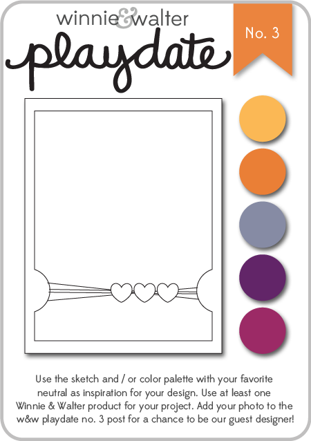
I stumbled across this challenge this evening and decided to do my best to get a card ready to participate. Winnie & Walter is a fairly new stamp company. I've been seeing their stamps used on a variety of blogs I follow. I don't own any of their stamps yet, but they also offer digital files. I downloaded a file to cut on my Silhouette, and used the sketch provided to create my card.

w&w_playdate3_august2014

I chose to use the sketch along with some of the suggested colors. Here's my card:


I started with a kraft cardstock base. On top of that is a layer of an orange sunburst paper that I edged with Worn Lipstick Distress Ink. The purple layer is a scrap of cardstock I had that I coated with clear embossing paste, using a stencil from Jenni Bowlin. After that dried, I punched out the half circles, and used the Worn Lipstick again around the edges. The "hello" is the digital file I downloaded from Winnie & Walter. I opened the file on my Silhouette and discovered that I didn't know how to cut a png. I had to get on the web to do a little research, but found it was quite easy after all (sigh of relief). I cut it from a pink patterned paper from a Colorbok paper pack - Light Bright. That's also where I got the orange starburst paper. I wrapped some thin gold cord from my stash around the card, creating some loose loops. I glued the loops down with Glossy Accents, also using that to attach the flower and button. For the "hello", I used teeny tiny drops of Glossy Accents to be sure it would stick to the embossed paper beneath. Finally, I used some Scotch 3M Mounting tape to attach the purple panel to the cardfront. This gives it a little extra height which is kind of cool.

I don't know why I create these situations for myself, but I was bound and determined to submit this - the deadline is later tonight. I'm happy with my result and I guess that's what counts the most!

Till next time,

Immi


Friday, February 21, 2014

Playing with Watercolor

I had some fun today visiting several blogs on a blog hop featuring the new spring releases from Simon Says Stamp. I enjoyed seeing all the different ways the artists used the new items. Several of the blogs featured videos showing how the cards were made. One of those bloggers, Kristina Werner, used a technique I wanted to try right away (follow the link if you'd like to see her video). Although it's not a new technique, I hadn't worked with it before, but I found it to be easy and fun. 

Here's what you need for the technique:

Press the ink pads down on the craft sheet to leave some of the color on the surface. Spray liberally with water; then begin pressing the watercolor paper down into the ink. Dry with a heat gun or allow to air dry, then continue pressing the paper down into the inks to get a beautiful, multicolored look.

I used some of my Sizzix dies to cut out shapes, then made several cards. Since the watercolor paper is heavy, I find that I need a heavier adhesive to get it to stick well to the card. I would recommend either Glossy Accents by Ranger or Diamond Glaze by JudiKins. They both are excellent as a strong adhesive or to add a shiny, glossy coat to an embellishment.


Here are the cards I made this afternoon:


All these cards are destined for Operation Write Home, to be sent to American troops for them to use as mail home to family and friends.

Happy crafting!
Immi