Monday, September 15, 2014

Challenge: Rock the Techniques

Today's challenge on Simon Says Stamp is to feature a project using the technique of your choice. I've decided to post a card I made using watercolors and liquid frisket. If you aren't familiar with it, frisket is used to mask off areas in order to retain the white paper before doing any watercolor painting. I got this idea from an online class called Watercolor for Cardmakers. I haven't done too many of the lessons yet, but I'm enjoying what I'm learning and having fun playing with paper and watercolor.

Here's my card:

I stamped the "thanks" greeting (Stampin' Up!) with black ink and made sure it was completely dry. I painted over it with frisket. After the frisket was dry, I then blobbed on (highly technical term) some watercolors. I added a few splatters and let everything dry. When I peeled off the frisket, the stamped image was still nice and clean underneath. Simple and fun. I mounted the watercolor paper on a pink card base and that was that!

Happy crafting!
Immi

Friday, September 5, 2014

More Alcohol Ink Cards

As promised, here are some additional cards I did that utilized alcohol inks. These all use the same cool filmstrip stamp by PaperArtsy. They all have a similar feel with lots of fun layers of miscellaneous papers. All three also feature the same "missing you" stamp from Tim Holtz.


The first card doesn't have much stamping - only the sentiment and the filmstrip image. The rest of the color and interest comes from layers of paper.


The next card also has some stamping along the purple cardstock (a border stamp - unknown) and along the gold cardstock to the left (Technique Tuesday). The panel of text is from an old book.


Finally, the last card also has limited stamping - again, the filmstrip and the sentiment. The alcohol ink background makes a stronger statement here. 

That's it for now. I enjoyed making these and sharing them with you.

Happy crafting!

Immi


Tuesday, September 2, 2014

Winnie & Walter Playdate #3

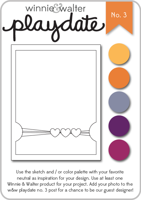
I stumbled across this challenge this evening and decided to do my best to get a card ready to participate. Winnie & Walter is a fairly new stamp company. I've been seeing their stamps used on a variety of blogs I follow. I don't own any of their stamps yet, but they also offer digital files. I downloaded a file to cut on my Silhouette, and used the sketch provided to create my card.

w&w_playdate3_august2014

I chose to use the sketch along with some of the suggested colors. Here's my card:


I started with a kraft cardstock base. On top of that is a layer of an orange sunburst paper that I edged with Worn Lipstick Distress Ink. The purple layer is a scrap of cardstock I had that I coated with clear embossing paste, using a stencil from Jenni Bowlin. After that dried, I punched out the half circles, and used the Worn Lipstick again around the edges. The "hello" is the digital file I downloaded from Winnie & Walter. I opened the file on my Silhouette and discovered that I didn't know how to cut a png. I had to get on the web to do a little research, but found it was quite easy after all (sigh of relief). I cut it from a pink patterned paper from a Colorbok paper pack - Light Bright. That's also where I got the orange starburst paper. I wrapped some thin gold cord from my stash around the card, creating some loose loops. I glued the loops down with Glossy Accents, also using that to attach the flower and button. For the "hello", I used teeny tiny drops of Glossy Accents to be sure it would stick to the embossed paper beneath. Finally, I used some Scotch 3M Mounting tape to attach the purple panel to the cardfront. This gives it a little extra height which is kind of cool.

I don't know why I create these situations for myself, but I was bound and determined to submit this - the deadline is later tonight. I'm happy with my result and I guess that's what counts the most!

Till next time,

Immi


Alcohol Ink Cards

Whew! I can't believe that it's already September. Looking back, I see that it was July since I last posted, but in my defense I've had a lot of great family stuff going on.

I thought I'd share some cards I did using alcohol inks. I don't get these out very often - they can be messy, and I am limited in the techniques I've learned for them. I do love the cool backgrounds that can be created with them, so here goes.


This first card has a bright and bold background created with alcohol inks on glossy cardstock (all the cards I'll show use glossy cardstock). The cute little partygoers is a stamp from Prima. The "happy birthday" is from a Tim Holtz set. I did a little simple watercoloring with dye inks on the kiddos' clothing, and mounted the panel on some bright orange cardstock. One of these days, I'm going to run out of that cardstock and I will be so sad. It's actually leftover covers from a planner made one year at the high school where I worked. Rather than toss them in the recycle bin, I brought them home - the color is great and the paper has a cool texture to it.


This next card is more subdued, and I used some metallic mixative along with the inks which gives it a pearlized sheen - very pretty! I stamped a large leaf (Rubber Nature ArtStamps) along with the "hello" sentiment (Jillibean Soup) and mounted both on some gray cardstock I ran through my Sizzix with an embossing folder to give it that raised text.


This card with the sweet bird shows another bright alcohol ink background, but just a little strip of it. I like the way it adds some great color to a black & white stamped image. The card front is stamped with a French script stamp (Hero Arts), a flourish (unknown), and a great scattered dot stamp I've had for years (Stampin' Up!).

One more...

This one might have been better with a less busy background, but I do like the combination of colors. The gorgeous flower arrangement is a stamp by Prickley Pear. I should try coloring it with watercolor someday.

I've got a few more cards that I'll post later - they all feature the same stamp.

Till then,

Immi


Tuesday, July 22, 2014

Challenge: Spots & Dots

I'm participating in the latest Wednesday challenge at Simon Says Stamp: Spots & Dots. Now, I can't seem to help myself - whenever I think of dots, I usually turn to a Hero Arts stamp set I've had for a long time with 4 different sized circles. It's called "Box of Dots" and I bought it years ago when my husband and I were in San Antonio. I talked him into a stop at the famous Stamp Antonio store. (Side note - that made me wonder if they are still in business; apparently they closed in March of this year.)

Anyway, I always seem to gravitate towards bright colors when I use this set. For another challenge post where I chose to use this set, click here.


For this card, I stamped my dots in various bright inks from Stampin' Up! I also used another circle stamp (the one in yellow). I like the overlapping of the circles and the additional colors that result. The sentiment is (I think) a Heidi Swapp stamp which is meant to be stamped in a single line. I cut it apart so that I could stamp it as shown. I added a bow with sheer pink ribbon and mounted the stamped piece onto a turquoise card base. This one was pretty quick and easy, and I always enjoy using bright colors.

Happy crafting!

Immi

Sunday, July 20, 2014

Challenge: About A Face

This week's Monday challenge on the Simon Says Stamp blog is called "About a Face". The challenge is to come up with a project that features a face - a clock face, a person's face - the interpretation is open. 

After seeing an inspiring video tutorial on coloring with Distress Inks and Cut & Dry Nibs, I decided to give it a try. I pulled out a collage-style stamp I haven't used in a looong time. It's called "Small Rose Collage" by Paper Inspirations. The video I had watched suggested using Specialty Stamping Paper by Ranger which I didn't have. I thought the technique might work on some glossy paper I had in my stash, so that's what I used.

I stamped the image using black Archival Ink, which will not bleed when touched by water. This is important for the coloring, since the Distress Inks would make other black dye inks run. After heat setting, I followed the instructions on the video and used the nib to apply ink to the stamped image. I heat set after each color to prevent smearing. After all the coloring was done, I rubbed some darker Distress Ink on the edges to give it some definition.

I decided to use the image to make a card and went with a top-folding style. I rarely do this type of fold, but it's very popular right now so I  hopped on the bandwagon. I trimmed my stamped image and mounted it on a pale pink cardstock and wrapped some black & gold ribbon around the bottom. I mounted this panel onto a black card base. Normally I would stamp a sentiment for the card front, but I chose to leave it off this time. I think this card would work for any occasion, or just to send a note.

Here's my finished card:


Happy crafting!

Immi

Tuesday, July 1, 2014

Challenge: W is for White!

This week, Simon Says Stamp issued a challenge to use the color white. I thought it would be interesting to stamp and emboss in white on kraft colored cardstock. Here's how it turned out:


Kraft cardstock is great because it lends itself to any color combination you like. It can have a masculine or feminine feel, depending on what you do with it. I chose to use a flower flourish stamp with rather bold lines. I stamped with Ranger's white pigment ink, and heat embossed with white powder. I've learned the hard way that it's worth it to take the time to prep the paper before stamping or adding the embossing powder. Otherwise, little specks of embossing powder end  up where you don't want them and it's a pain to try to brush them off! I use a powder applicator by EK Success, but any brand will do.I stamped the sentiment on a separate piece of paper using ColorBox Warm Red chalk ink, and heat embossed that with a red powder. I ran some red ink along the edges after notching the ends. I trimmed the kraft piece down to fit on a white speckled card base, allowing the white to serve as a frame.

This was a quick and easy project, and I'm happy with the way it turned out. I hope the recipient likes it!

Immi